
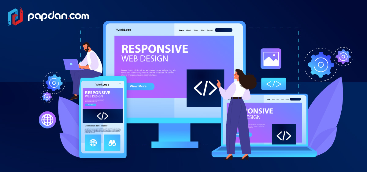
A responsive website is one that can adjust to any browser or device, with any particular resolution, without compromising the layout or requiring users to scroll horizontally. As a result, it contributes to the creation of seamless user experiences across all platforms and devices. Responsive web design need to be the norm for site designers. 73.1 percent of visitors will leave a website with a non-responsive design, according to a GoodFirms survey. Regardless of the device they’re using, top-notch user experiences must be created that are consistent and meet their needs.
Components of responsive web design
Without knowing the technical aspects of responsive design, it might be challenging to understand its nature. Responsive layouts, media queries, and adaptable media are the three characteristics that distinguish responsive websites.
Responsive layouts
Making a website’s layout responsive entails using a responsive grid. CSS is used to create responsive grids. Columns in a web layout are composed and adjusted automatically to fit the screen or browser window.
Media queries
It takes more than a flexible layout to adapt designs to various screen sizes. A layout that is too compact might begin to deteriorate and produce columns that are too thin to show material properly. But media queries can come to your rescue.
Adaptable photos and videos
Images, movies, and other sorts of media need should scale as the viewport is resized. A responsive design distributes all components in adaptable containers that resize when a user moves their browser window or uses a different device. Setting the max-width attribute to 100% makes media content scalable in a straightforward manner.
Best Practices for Responsive Web Design
Flexible Everything
For the creation of flexible websites, flexibility is essential. Everything must be responsive, including layouts, graphics, text blocks, and components.
Pay Attention to Breakpoints
At least three breakpoints should be included on every web page (mobile, tablet, and desktop). For greatest device versatility, we advise using five breakpoints, as was already specified. In certain cases, website designers might also need to take Android vs. iOS device performance into account
Utilize Scalar Vector Graphics (SVGs)
Try to replace raster graphics with SVGs whenever possible, especially for icons and logos. SVGs maintain the same resolution at any size because, unlike raster images, they change their resolution depending on image paths rather than pixels.
Modify Images
For mobile-friendly design, responsive photos are necessary, including cropping and scaling. You might need to trim certain photographs for smaller displays in order to maintain their effect. Creating square versions of landscape images for mobile devices, as an example.
Consider Card Interfaces
Card UI patterns serve as more mobile content containers that help you save a tonne of time. You can automatically scale, fit, and fill designs with UXPin’s Auto Layout to improve the responsiveness of cards and other components. Because UXPin’s auto-layout is based on flexbox principles, engineers may copy and paste CSS during design handoffs with ease.
Mobile-First Design Strategy
Starting with the lowest screen size and scaling to the largest viewport is what is meant by “mobile-first design.” When scaling down, designers who begin with the largest screen frequently have to remove aspects or make concessions.
Minimalism Is Important
Here are three reasons for why minimalism is a crucial ideal technique for creating flexible websites.
- Content reduction reduces clutter, making it simpler for people to read and comprehend.
- Consistency across many devices and screen sizes is made simpler with a basic UI design.
- Less-contented web pages that load quickly thanks to HTML, CSS, and Javascript improve user experience for website visitors and boost search engine optimisation.
Set Priorities and Properly Hide Content
Designers must decide which material is always displayed and what they may conceal because there is less room on lower screen sizes. The most typical instance is when mobile devices’ main navigation is housed in a drawer.
In order to create a cleaner, more simplistic user interface across all devices and screen sizes, designers may also utilise progressive disclosure to conceal non-essential material and information.
For instance, to limit visible material and provide cleaner layouts, the majority of eCommerce websites conceal size guidelines using modals, tabs, or accordions. Customers may still click a link to view these tutorials
Large Clickable Area for Buttons
Fitts’ Law asserts that buttons with big clickable regions facilitate user engagement. In order to prevent visitors from mistakenly clicking the wrong link or button, which might be annoying, designers must leave enough distance between links and buttons.
Research Industry Leaders and Competitors
Investigating rivals and industry leaders is one of the finest methods to become familiar with and remain on top of the most recent developments in responsive web design. If you’re developing an eCommerce website, for instance, consider how well-known international firms like Nike, H&M, and others create their sites. Why not take advantage of the millions these companies spend on R&D and testing best practises?
Hire a Web Designer for Responsive Web Design
Hiring a qualified Melbourne web designer or developer is the best method to achieve a site that is really responsive. There are many high-performing websites, but none of them were built by amateurs. For responsiveness and speed, they have been meticulously planned, constructed, and developed.
When creating a responsive website, there are a lot of details to take into consideration, especially if you want it to wow your visitors on all of the popular gadgets of today.
Professional website designers are equipped with the expertise and creativity to meet any issues that flexible or adaptive design may provide. By outsourcing the task to a professional, you can make sure that your website is quick to respond and efficient at turning visitors into customers.
