
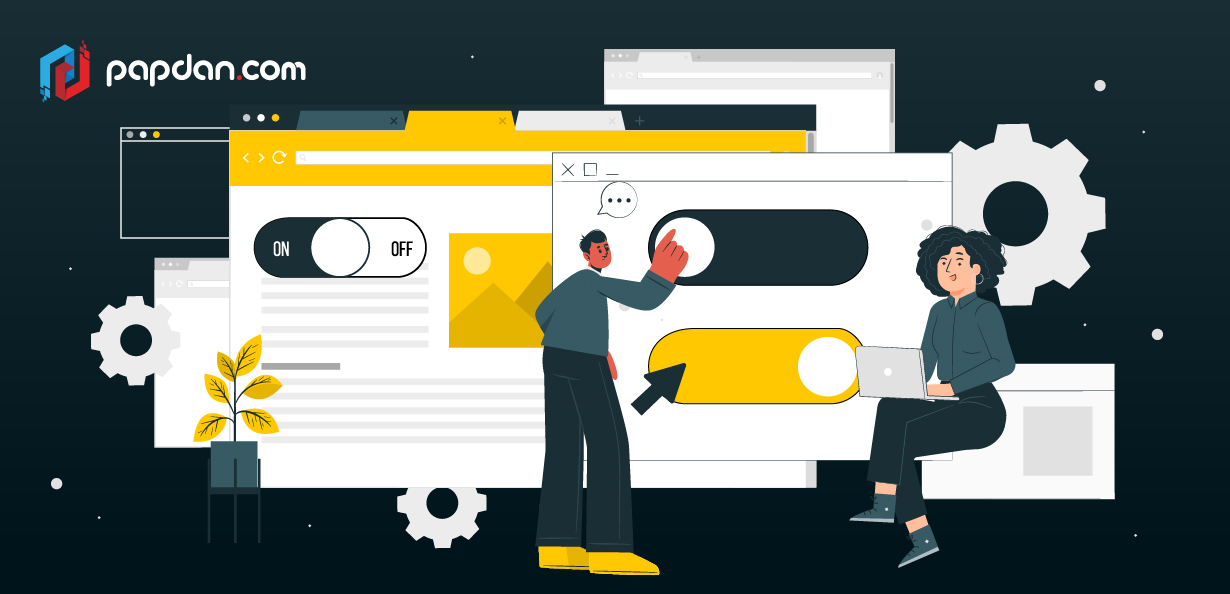
One of the features used most frequently in UI and UX design is the toggle switch. It demands an overview of the overall flow and navigation of the application you’re building, just like any other typical design feature. As a web designer, you must pay closer attention to the questions that must be answered. The toggle switch UI element might be your prefered choice, depending on the kinds of replies a user is expected to give.
Toggle switches are used for a variety of purposes, and in this post, we’ll explain what they are, when to use them, and provide you some best practises and design inspiration for your upcoming project.
What is a toggle switch?
Toggle switches in UI/UX design imply that the user must select between two possibilities that are mutually incompatible by definition. When the user flips the switch, the selected choice briefly interacts before taking instant effect. The toggle switch’s design is inspired by everyday objects. Simply take a look around your everyday activities to discover how many actual toggle switches—like light switches and kettles—are in use. How can you include these toggle switches into your design as a Melbourne web designer? Continue reading to find out more.
When should you a toggle?
The best purpose for toggle switches is to change the status of system settings and functionality. A toggle switch should be included in your design if you wish to satisfy the user’s requirement to alter or update preferences and settings. Toggles, like checkboxes or radio buttons, have very defined applications, which makes their design a little complicated.
When deciding whether to use a toggle switch in your design, keep in mind the following two guidelines: a toggle switch should be used when an immediate reaction is necessary without evaluation or confirmation, as well as when a setting calls for an on/off or show/hide function. However, how can you create a toggle switch that works for you?Take a look at the following best practices.
The toggle switch should have an immediate effect.
As we have mentioned, toggle switches are inspired by everyday objects. Consider the light switch as an example and consider how it functions. You push the button once to flip the lights on and one more to turn them off.
Toggle switches are used in UI/UX design to easily replicate real-world switches, making them simple for users to comprehend and use. In other words, a user shouldn’t need to click Save or Confirm after interacting with a toggle in order for the changed state to take effect. Instead, the user’s selection of the choice has an instantaneous impact on the status of the system’s functionality and preferences. When system delays prevent instant outcomes, you can think about including a processing status loop animation to assist the user understand when their toggle is being used. But keep in mind that the procedure should just take a few seconds.
Maintain consistency in the visual appearance of your design.
It is well-known that users may anticipate what will happen when they interact with a UI element based on its outward look. Users would be forced to pause and consider how to engage with the UI if your design is inconsistent with what they already know. Make sure that the visual language you decide to use for toggles is applied consistently across your design and that it is utilised for all toggles in your app.
Additionally, keep in mind to adhere to the platform’s default aesthetic style. That’s because users who are familiar with a platform may quickly understand the UI when your toggles’ appearance adheres to platform design guidelines.
Write clear labels
When we encounter a toggle switch with clear labelling, it will be simpler for us to comprehend which choice it controls and what condition it is now in. Make sure your labels are concise and easy to read while drafting them. It is recommended to use no more than two words to succinctly describe how the toggle controls work. Additionally, you should utilise a left-aligned inline label since this style of label works well with how consumers scan layouts. Just bear in mind that toggles can only be ON or OFF, and that adding more text labels can clutter your interface.
Optimize your toggle switch for mobile devices
As a UI/UX designer, you should ensure that your mobile toggles can be used with a variety of goods. To do this, you must make sure that the layout typically enables both of the following: users must be able to touch the toggle without difficulty, and there must be enough room between components to allow the interface to breathe. Utilizing a design tool like Mockplus will allow you to pick between Android and iOS toggles to suit your design requirements, greatly enhancing the user experience of your mobile design.
Try out your toggle design
Last but not least, in order to make sure that a system failure won’t occur, you should carry out user testing before publishing your design. Just remember to check for usability issues with both the overall UI design and the specific toggle components. An A/B test is the most practical and effective way to evaluate your toggle design. You should test the visual hierarchy on the full page as well as on the particular component when it comes to toggling design. Additionally, don’t be scared to experiment with the labels until you discover one that the consumers can comprehend easily.
