
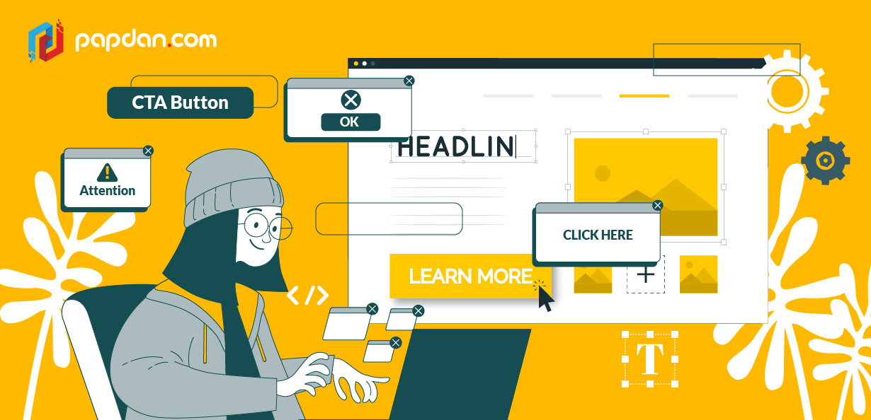
A solid call to action (CTA) is an essential element for every Melbourne digital marketers and melbourne web designers. A call to action (CTA) can persuade your visitors to take the action you recommend. On practically every page, there should be a call to action – doing so will undoubtedly assist you in achieving your objectives. In this post, we’ll go over how to develop a great call to action, where to put them, and how to avoid common pitfalls.
What is the definition of a call to action?
A call to action is a type of trigger that prompts visitors to take action. It doesn’t matter what action you want them to do. You could want them to buy something, subscribe to your email, submit a review, or just go to another page on your website. Whatever your online objectives are, a well-placed CTA may lead your users through the actions you want them to do.
A CTA is frequently written in a commanding tone, instructing the user on what to do. This includes terms like “purchase,” “read,” “find out,” “obtain,” and others. Giving your users orders might be a little weird at first. Putting your calls to action in a button or a call-out box feels less uncomfortable since it separates your orders from the rest of your (more natural) material.
Why is it vital to have a call to action?
Every website, as well as every page on a website, has a purpose. However, if you don’t include a CTA, your visitors are likely to read your material and then depart without doing anything else. Users will stay on your site longer if you employ calls to action to encourage them to become devoted fans or customers.
CTAs are even more critical if you want your users to follow a specified set of actions to complete a task. They can establish a roadmap for your visitors, directing them to the material they need to see or the actions they need to do to purchase a product. Your users will be left guessing what they should do next if you don’t provide these’signposts.’
How to write effective call-to-actions (CTAs)
There are a few things to keep in mind while creating a CTA button:
Make Buttons Appear Clickable
Because one of the first tasks of any CTA is to get people to click it, the design of the CTA should match the goal. People don’t want to find out which design components are interactive when using a product. As a result, it’s critical to make sure all interactive components are clickable.
What makes a button appear to be clickable? It is, first and foremost, a visual display. When designers apply a 3D effect to a button, it may appear more clickable. A CTA with a minor gradient or a faint shadow, for example, frequently evokes the impulse to press a button since it appears more prominent. If a button with a 3D effect isn’t appropriate for the selected style, such as flat design, clickability might be highlighted by using rounded corners.
Use Colors That Contrast
Color selection is influenced by a number of factors, making the procedure more difficult. Designers must examine the composition’s fundamental hue as well as the target audience’s prospective preferences and psychological characteristics.
There is one criteria to bear in mind when picking colours for CTAs: buttons and background colours should be sufficiently contrasted to make CTAs stand out from the rest of the UI. For example, if a designer utilises a blue colour palette for the layout, red or yellow CTA buttons would be an excellent choice.
Select the Right Size
One of the most frequent strategies for organising UI components according to their relevance is size. The more prominent an element is, the more obvious it is. Because the primary objective of CTAs is to attract users’ attention, designers strive to make them stand out among the other buttons on the screen, particularly in terms of size.
Even while large buttons have a higher probability of being spotted and clicked, you must keep some boundaries in mind. A compelling call-to-action button is generally large enough to be easily discovered, but not so large that the layout’s visual composition and hierarchy are ruined. In their instructions, market leaders frequently provide suggestions on the most effective button sizes.
Fewer words, more urgency
CTA microcopy is a call to action that informs users of what they will do if they click the button. The effective CTA microcopy must grab visitors’ attention fast and direct them to take action.
You should limit the amount of words in your call-to-action as low as possible. A few well-chosen words can be used considerably more quickly than a big detailed phrase. Furthermore, by using imperative case in CTA microcopy, you provide clear and concise directions for what consumers should do next.
Always keep the user’s flow in mind
Big size and vivid colours are powerful tools for grabbing users’ attention, but clever placement may boost CTAs’ chances of being spotted even more. The user flow, also known as the user journey, is a path that consumers take through a digital product to perform a task, such as making an online purchase. Users flow aids in the creation of UX in such a manner that people may go step by step towards their objective while obtaining facts gradually.
You may determine effective CTA button location by considering the customer path. When designing a landing page, for example, you must ensure that customers can discover the “Sign up” CTA button after reading the information about the offer or services. Users will be aware of what they are signing up for and if they require it. If visitors see such a CTA button before reading the material, there’s a good probability they’ll dismiss it.
