
Colors influence how we see the world. Most of the time, our emotional response to color is so deeply embedded in the subconscious that we aren’t even aware of it. Brands take full advantage of this by using color to elicit specific emotions and connections.
Website color schemes are an important part of web design, which should come as no surprise. The appropriate color scheme may bring all of the design aspects together, improving not just the website’s looks but also the user experience.
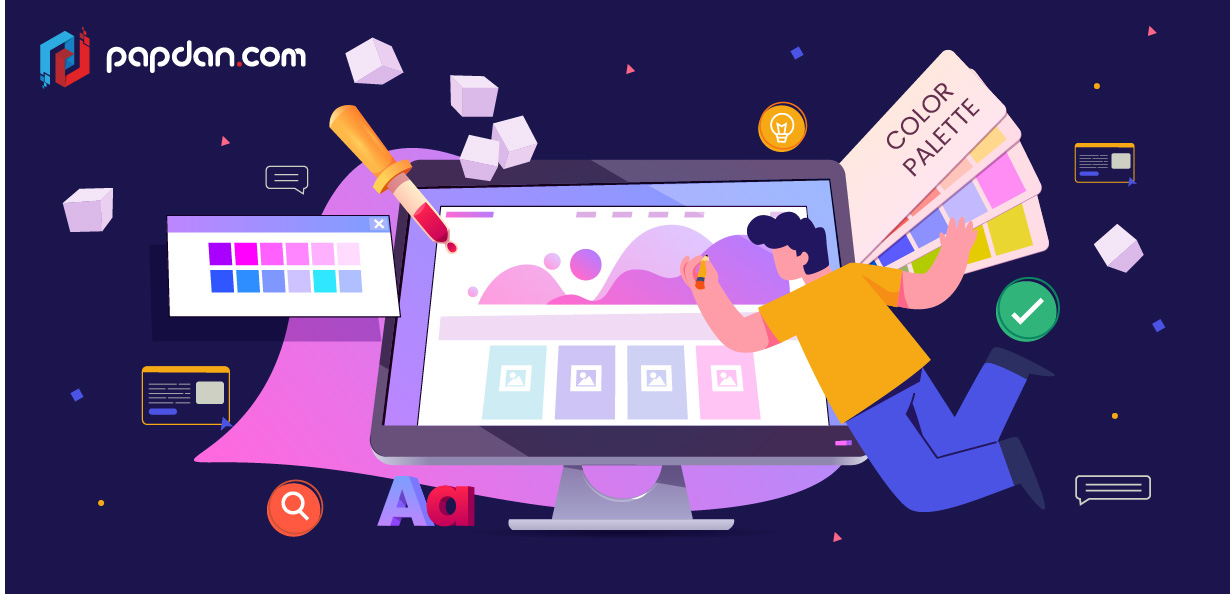
The Importance of Color Schemes on Websites
We’ve previously established that the color scheme of a website is important in web design, but let’s go further into that aspect.
Mood Setting
Users can typically tell whether or not they like a website in less than a few seconds. And, because colors account for 62-90 percent of their first impression, the value of your website’s color scheme skyrockets.
Because colors are so strongly tied to emotions, knowing how to use them effectively is critical to creating the perfect tone for your website. You instantly improve your influence over your visitors’ emotional responses by generating your desired ambiance.
Highlighting the Right Elements
Primary and secondary colors may be found on any website. The former is designated for subheadings, menu items, supplementary content, and so on, while the latter is used for headlines, key messages, and CTAs. Why? Because the contrast between the various colors makes the proper ones shine out.
The fact that most websites use red or other bright colors for their CTA buttons is no coincidence. The contrast in hue draws the viewer’s attention to the proper spots right away. The combination of main and secondary colors makes it much easier for visitors to locate what they’re searching for, significantly improving the site’s user experience.
Increasing Brand Awareness
A website serves as a brand’s online presence, thus it must reflect the brand’s identity. Your website’s colors should represent your company’s personality, just like your logo colors do.
According to studies, a distinctive hue enhances brand identification by 80%. That’s a big figure, so let’s see what we can do to explain it. We recall brands primarily by their primary hue due to our great color memory. Consider Coca-Cola, for example: the vivid red color quickly comes to mind.
Consistent use of your brand colors throughout your website will strengthen your business’s visual impression in the minds of your visitors. The more you use your distinctive colors, the more likely your company will be remembered and recognized.
This article will show you which color palettes are popular right now so you can pick the ones that best suit your website’s brand and make your consumers feel.
Adventurous pastels
Pastels are lovely. They’re gentle and sweet, and they’re the ideal palette for spring. Pastel colors, on the other hand, aren’t exactly adventurous.
Expect to see more designs with a spin on pastels in 2022. Pairing them with geometric forms, line graphics, or showing them in full-on, crazy patterns that aim for a maximalism design approach by filling space with objects, colors, and patterns might be one way to give them a twist.
Designers are subverting expectations by employing pastels in unusual and imaginative ways to generate discord or edginess. They’re experimenting with saturation to produce stronger pastels, or mixing neons and complex patterns with them. The outcome is a pastel with a lively sense because to the more bright colors and patterns. It’s unusual, but not out of the ordinary. It’s soft and prickly at the same time. It’s a great approach to recreate classic hues while also pushing the envelope by reimagining something we all thought we knew.
Colorful Memphis design
One of the defining design trends of the 1980s was Memphis design. Colorful, abstract geometric forms and squiggles are prominent in its aesthetic. It was a rejection of the preceding decades’ high art and minimalism.
After years of refined, basic color palettes, Memphis design’s abstract forms and color combinations are resurfacing to reintroduce vivid eccentricity into the mainstream. What we get are color combinations that are lively, enjoyable, and don’t take themselves too seriously—exactly why it’s making a major resurgence in color trends for 2022.
Retro 70s and 80s color schemes
In 2022, we’re collectively seeking calmness. Working with subdued, soothing hues is one method to create a tranquil design, as you can see from the other color trends we described above. Another strategy is to appeal to viewers’ nostalgia by invoking “lesser times” in the past. Of course, crises and difficulties have always existed to keep the globe on edge. However, perception is everything in design. When most people think about the past, they imagine a less hectic and complex world than the one we live in now.
Rustic, earthy muted tones
Pastels aren’t the only soft hues that will become more popular in 2022. Designers are expected to use a wide range of subdued hues.
If you’ve been paying attention to color trends in recent years, you’ll note that this is a stark contrast to the neons and bright hues that dominated previous years’ designs. This might be because our boisterous, bold, and brilliant environment has overstimulated and fatigued us all. Many of these hues push their designs into the rustic realm, giving a soothing and refreshing back-to-nature sense.
Vintage flower power
Floral hues in toned-down, desaturated color palettes, commonly employed in floral patterns, are one of the color trends expected to take center stage in 2022. Muted hues are employed in these designs to give the flowers a dried-out, yellowed appearance. Designers create flower designs that feel rustic, old-school, and comfortable worn in by using these color palettes.
Designers give these floral arrangements a vintage air by desaturating and toning down the colors—retro in the sense that time has passed and the blossoms have dried out. The message is clear: these blossoms are delicate and exquisite, so treat them as such.
