
Have you considered making your product or website more user-friendly? Perhaps this is the first time you’ve heard of the term “learnability.” Building a learnable website is a difficult process that needs some experimentation and A/B testing.
Learnability’s purpose is to provide an intuitive interface that users can rapidly grasp. In an ideal world, no documentation is required to teach your consumers how to use your product.
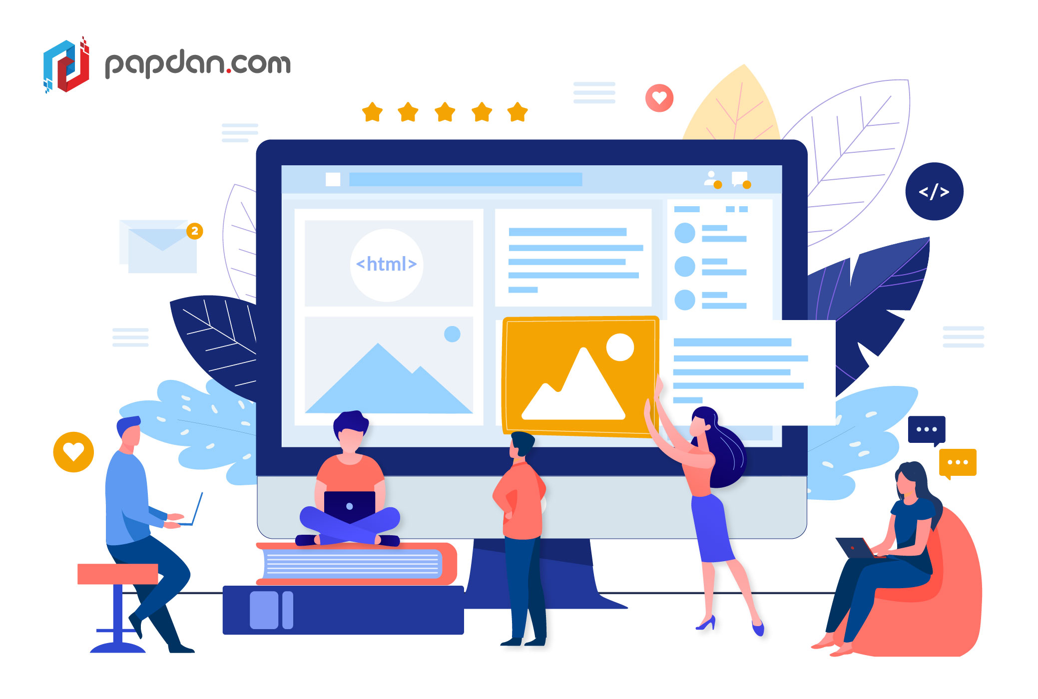
Fortunately, there are a variety of methods for creating a user-friendly interface. In this article, we curated five techniques that had been proven effective by web design communities for making your user interface more understandable.
- consistency
- feedback
- sticking to known UI elements
- familiarity
- storification
But first, let’s emphasize why learnability is important.
What Is the Importance of Learnability?
So, why is learnability important? There are several reasons why you should consider making your user interface more understandable.
For starters, consumers can quickly adapt to a new interface. As a result, they will be able to do their task considerably more quickly with your product. To put it another way, they can get more out of your tool. Furthermore, there is no need for substantial documentation or a service center. By offering a simple interface, you want to limit the number of help inquiries.
But there’s more! Think about the users’ experience. A user who learns your tool fast will have a better experience. At the end of the day, the user wants to get value in the shortest amount of time feasible. They do not want to devote a significant amount of time to master a new tool.
Finally, learnability has an impact on your retention rate. Users will be frightened by a complicated UI. Frequently, people will seek simpler options that offer the same value.
Now that we’ve established the necessity of learnability, let’s look at five recommended practices for improving it.
Consistency
First, let’s talk about the significance of consistency. Google has perfected consistency with Material Design, which gives all of its products a uniform appearance. As a result, it’s a lot easier for people to comprehend how new Google products function when they transition between them. Why? Users are familiar with this design and know how to engage with it. This predictability leads to patterns that can be learned. This is true with everything from sidebar menus to icon use to link color.
Feedback
Feedback is a term that appears in almost every UI design book. Feedback may be quite subtle. This is referred to as micro-interactions. Micro-interactions can take many forms, including:
- color changes
- transition effects
- animations
- a checkbox being checked
These micro-interactions are critical because a user need proof that their actions have had an impact on the website. Consider this scenario: you click a button to submit a form, but the button gives you no feedback. To put it another way, the page does not change. I’m guessing you’ll push the submit button again because you didn’t get any proof of your activities. As a result, be kind and offer feedback to your customers. It will make their experience a lot more pleasant and less perplexing.
Stick to Best Practices
To give familiarity to your design, rather than recreating the wheel, leverage current design concepts. The hamburger menu, for example, is one of the greatest ways to hide a menu on a mobile device. There’s no need to create an alternative to hamburger menus because everyone understands how they function and what they’re for.
Make sure you’re following industry best practices. This also applied to web design. Stick to what has shown to be effective in the past. A shopping cart, for example, is located in the upper right corner of your page. Don’t go crazy and park your shopping cart on the left-hand side of the screen. Users will be confused as a result of this.
It’s critical to realize that if consumers don’t grasp your interface design, they’ll likely quit your website or seek out another that offers a better user experience.
Familiarity
A user’s familiarity helps them to learn new interfaces more quickly depending on their past experience. In other words, mental models are used through familiarity. A user’s mental model of one product can be transferred to another. This implies individuals may leverage their prior understanding of comparable interfaces to quickly learn a new one.
Furthermore, familiarity fosters trust and encourages users to explore and use novel interfaces with confidence. If you utilize Google’s Material Design language on your website, for example, consumers will be able to recognize elements and know how to interact with them. As a result, people aren’t hesitant to click a certain button since they know what will happen. For a user to feel comfortable exploring new technology, reliability is essential.
Storification
Maybe once in a while, you may wish to introduce a product with a disruptive interface. We can’t merely rely on the previous strategies to help us learn faster in this situation. In this scenario, you can make the procedure simpler with a narrative. You may use storytelling to make the information you offer simpler to absorb and recall by narrating a story. Visual storytelling should be preferred over text-based storytelling. Users do not want to learn about an interface by reading large sections of text.
What works best in this situation? Create an engaging visual tale that takes the user through all of your interface’s key features. Keep your tale brief and simple, focusing solely on the essential aspects for the user to get started. There’s no need to go into detail about complex use scenarios. Additional guides can be written to cover these types of subjects. We don’t want to overburden the user with fresh knowledge, since this would have the reverse impact on their learning.
