
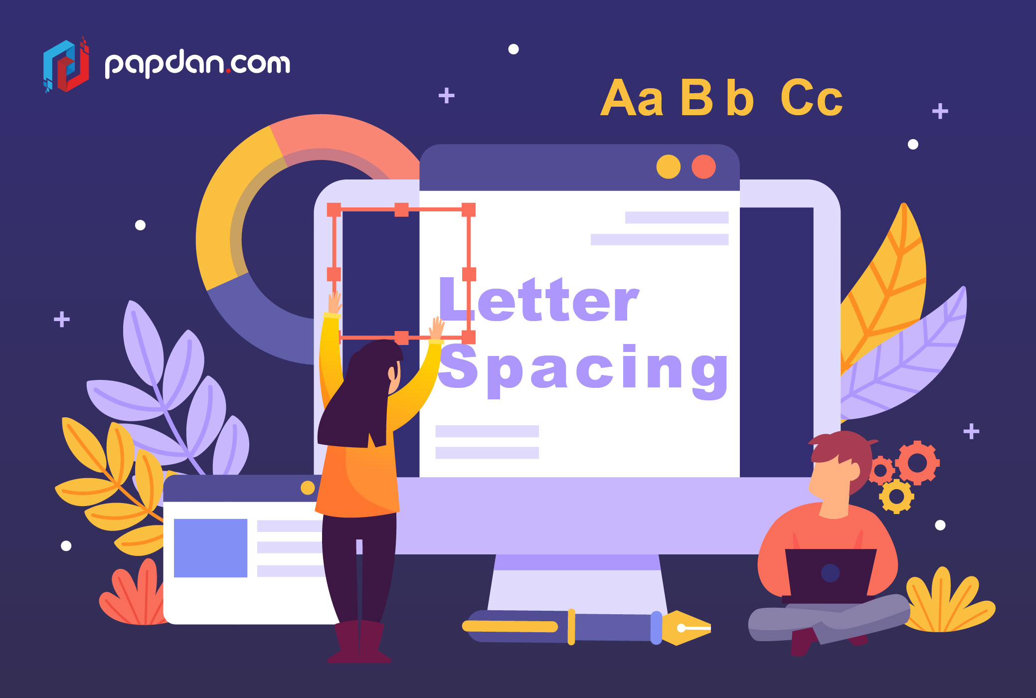
Since we consume the majority of the information by reading, it makes sense to pay attention to the writings in a web design. There are several dimensions of typography, but letter spacing was one that helped us to increase the consistency of our design.
Letter spacing refers to the amount of space between letters that may be added or removed. Some people compare letter-spacing with kerning, but the two are not the same; letter-spacing affects the whole line of text, while kerning only affects the space between two separate letters at a time. Kerning is best left to font creators, and unlike letter spacing, there is no way to manage kerning in CSS at the moment.
The Reason for Letter Spacing
The primary goal of letter spacing is to increase the text’s legibility and readability. Words have varying effects based on their size, colour, and context. You will help readers consume the material quickly and more effectively by adjusting letter spacing to the area you’re operating in.
Keep in mind that when creating a typeface, typographers consider letter spacing and kerning. It means you don’t have to use it in all of your writing, but you should know some simple concepts and use decent typefaces to know when it’s appropriate.
The Effects of Letter Spacing on Legibility and Readability
Line height, paragraph length, font size, typeface choice, letter spacing, and other factors all affect the legibility and readability of your text. If you’re new to typography, the smartest thing you can do about letter spacing is to avoid doing it excessively. That is to say, don’t make the gap between letters too large or small; even though you think it looks fine, people would fail to read it, ruining their experience.
Letter-Spacing Capital Letters
Capital letters are created with the purpose of appearing at the start of a sentence or proper noun when combined with lowercase letters. The space between capital letters is too little when they are placed close to each other. As a result, more space is needed in order to improve readability. This is valid for big and small font sizes alike.
Headlines and Letter Spacing
If you use well-designed fonts, you should be certain that they are well balanced and that you will not need to make any significant changes to them. The trouble with headlines, on the other hand, is that the distance between letters seems unbalanced at larger scales. The letter-spacing value may be increased or decreased to correct it.
There are no hard and fast guidelines for letter spacing since there are too many different typefaces to consider, but looking at how major corporations like Google and Apple handle their typefaces will provide a lot of useful insights.
Body Text with Letter Spacing
If you’ve ever read something about letter spacing, you’ve undoubtedly come across typographer Frederic Goudy’s famous proverb: “Anyone who letter-spaces lowercase will steal sheep.” (There’s a case to be made if he was just talking about blackletter fonts.) Some designers have adopted this as a hard and fast guideline, never adjusting the letter spacing in lowercase text again.
We can’t agree 100% with Goudy based on our experience and observations of designers’ work, because minor adjustments can make a huge difference in how the text works. Take, for instance, condensed fonts. The letters are too similar together at small sizes, resulting in low legibility. You can make the text easier to read by increasing letter spacing by 1.5 percent.
Letter-Spacing Captions
Smaller font types, unlike headlines and body text, don’t have as many differences in letter spacing. If a font size is less than 13px, it’s standard practice to expand the gap between letters to make it more readable. There are, however, still exceptions. And sure to play around with the settings.
Last but not least
Looking at other designers, especially type foundries, was one of the things that helped us develop our typography skills. You might note any variations in how they approach typography by decoding their work, which will support you in future ventures.
