
We all love getting a little bit of help every now and then but there are times when I was being given help I never asked for which ended up annoying me to no end. This case is most prevalent in the world of video games when the game insists on teaching you everything you already know instead of actually letting you play the game. In fact, this problem has became so big of an issue that simply typing in the word “hand-holding” and “video games” would lead you to countless thinkpieces and online discussions about how there’s excessive hand-holding in modern video games. Helps and tips are great but when used excessively, they can seem pretty insulting.
Just with the world of video games, web design & development relies heavily on the use of an interface to facilitate interaction between the website and the user. As such, it’s pretty common to see tutorials, hints and tips being used in websites to guide users into how best to utilize the service provided by the website, especially in the case of more complex web applications. As is the case with the world of video games, using these hints and tips in the guise of tooltips require some proper thought so as not to get in the way of users. The best kind of help is the seamless kind and you need to get in touch with web developers Melbourne that knows what they’re doing in order to achieve this.
Being helped by an invisible pair of hands
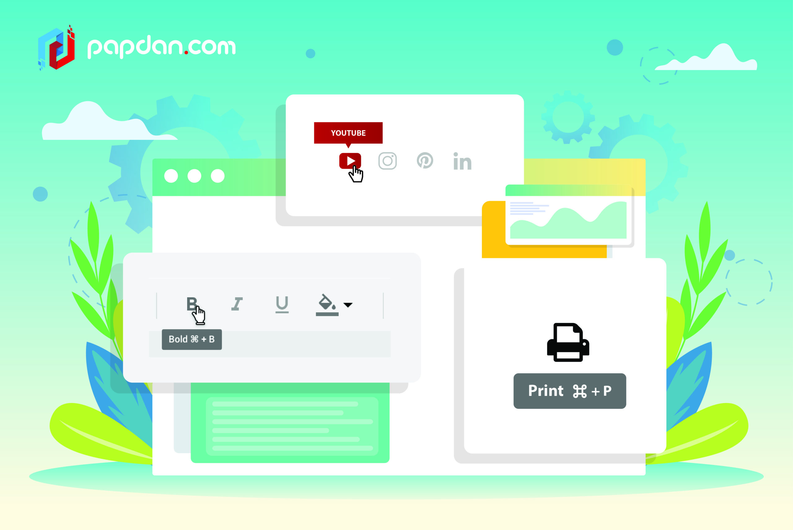
Traditionally, tooltips appear whenever users hover over a graphical element and is left invisible otherwise. In this way, tooltips act more like footnotes or annotations, appearing only when summoned by the users while left sitting on the sidelines otherwise. Over the years however, as web applications grow ever more complicated, variations on how tooltips are deployed have begun to pop up here and there. From tooltips that appear the first time you load up an application or those that act as a full-fledged tutorial experience, web developers have experimented on how best to ease users into their websites and web applications.
I’m here not to pass judgment on which method is objectively the best one as like every tool at our disposal, there are going to be cases in which one method is preferable over the other and cases in which the reverse is true. What I can tell you however is the fact that there are best practices in using tooltips that can be applied almost universally. The difference between a good and bad execution of tooltip can be like the difference between Batman’s Alfred and Star Wars’ C-3PO. The former is a loyal butler and an essential figure in Batman’s dual career and the latter as an inept service droid who would be totally helpless if not for the presence of the trusty R2-D2.
Make them optional
The very first thing you have to is to make these tooltips optional or at least mostly optional. By this I mean it’s okay if you’d like to make the first one visible by default just to indicate that they’re available but don’t summon the rest unless the user have given you explicit permission to do so. This is because no website or application is truly unique and chances are good that the user in question have used a similar service before and would feel right at home in your website even when this is their first time. This also applies whenever a new feature is introduced as users might not have the time at that precise moment to learn about said new feature.
I’ve seen plenty of websites and applications make the mistaken assumption that the typical user is incompetent fools that need to have everything spelled out for them. If you’ve done your homework on your UI design, there doesn’t have to be a generous amount of tooltips for your website as your interface should be self-explanatory. Tooltips then would only have to be necessary when there’s a complex and unusual element in your website. However, this doesn’t mean that you should leave out tooltips entirely as it’s normal as human beings for us to suffer from brain freeze every now and then and forget how things work hence why tooltips should be ideally made optional.
Show one tip at a time
If the tooltip is part of a beginner’s guide/tutorial, you want to make sure to not spam the necessary information on the user’s face and instead present the tooltip one piecemeal at a time. The idea is to provide one tip/step at a time and show users with information on how far along are they in the whole process. Information overload is a very real thing and dumping all of that information at once can make your website and/or application seem disorganized. Providing tooltip one at a time doesn’t just benefit the users by preventing information overload but to also imbue your website with a natural flow of operation.
Use tooltip to include supplementary information
You know how when you hover over a file in Windows you get a pop-up that details additional information on that specific file? In this case, tooltip doesn’t function as a tip per se but as a way for UI designers to include supplementary information without taking up space. If the information in question is actually essential to your website’s function and/or operation, you’re going to want to put it directly on the interface where everyone can see but if the information in question is only contextually useful or only for users that are actively looking for them, tooltip provides a clever way of displaying that information without requiring users to commit to an extra step.
Make sure that the existence of tooltip is clearly visible
The downside of the subtlety provided by the ideal tooltip is that they can be so subtle that users are left unaware of their existence in the first place. To combat this, you’re going to have to provide some sort of a clue to indicate that hovering over a given text or element would summon additional information. One way of achieving this is by simply relying on consistency and giving every similar object a tooltip. Another way is to use mouseover effect to indicate that something special is happening or by adding a simple question to mark to elements that might benefit from more explanation. There’s a balancing act here as you want to make it clear they exist without calling attention and this is something that would only improve with more practice.
