
One of the most important aspects in reaching adulthood is realizing the importance of everything in moderation. It took quite a while for me to realize that those morning headaches could be avoided simply by stopping after that fourth glass of wine or how I don’t really need another pair of $200 jeans when I have half a dozen pair of $75 jeans, which are way more than decent, sitting in my room. Too much or too little is never a good idea and both at the same, however improbable it is, is even worse.
It seems like a bit of a joke, having too much and too little at the same time but that’s exactly the case when it comes to the phenomenon of too much minimalism. Minimalism, from IKEA furniture to Marie Kondo and the humbleness of Kengo Kuma’s architectural design, is a hot commodity right now. As with everything that’s ever been in vogue however, it’s not uncommon for people to try and push that envelope past its breaking point and used too much minimalism, resulting in too little of everything, and that can prove to be disastrous in the world of web development.
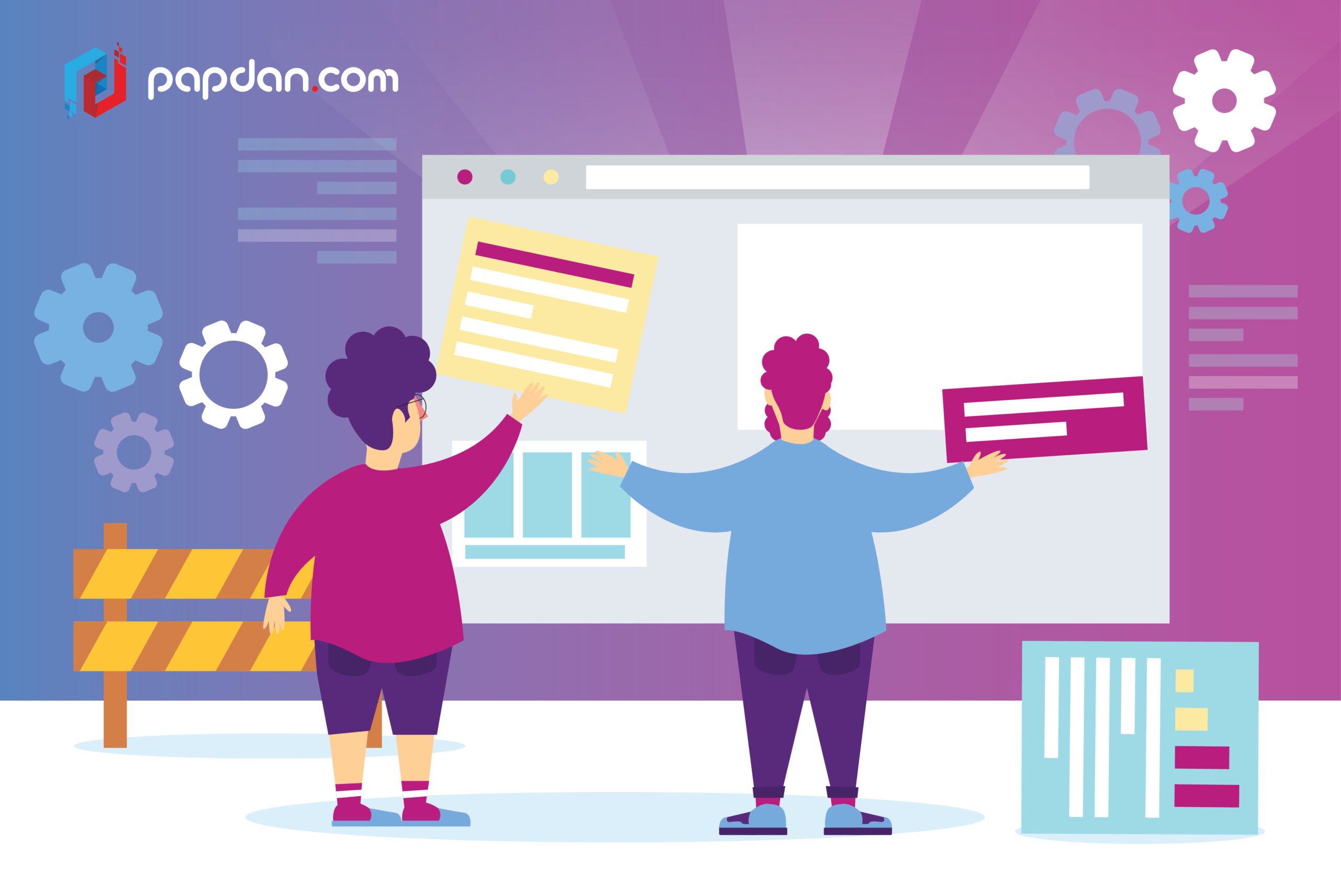
Too much of too little
As a general rule, I’m a fan of minimalism. I don’t like to wear anything that’s too loud and while I do sometimes listen to music that veers into the maximalist side of the equation, sparse production is where my heart actually lies. However, the problem with minimalism as a design language is that they can sometimes give the appearance of looking same-y. Basic tees and oxford shirts are versatile but they also lack any identifiable personality and if you want your business to stand out in this crowded landscape, having a website that you couldn’t pick out of a police lineup isn’t exactly a good idea.
Excessive minimalism can also lead to a functionality issue as well as too little of everything can leave users with incomplete and ambiguous information. You know how when you’re texting sometimes humor and irony could get lost in translation since you only have the text to hold on to? Excessive minimalism could also have the same effect as in the process of removing any superfluous and unnecessary elements from your website, you ended up removing some important information.
When you’re looking at proper minimalism in practice, that sleek and clean design might seem effortless, as if it’s something that could be achieved by almost everyone. That however couldn’t be further than the truth as achieving this delicate balance of simplicity while still clearly conveying all the essential information can be hard. Remember, your business website should be much more than just window dressing, the website should be able to provide all the necessary information about your business to the website’s visitors.
Start with a list of necessary information
Before you begin work on your website, you need to have a very clear idea on what information you feel you need to convey about your business. Once you’ve got this all figured out, make sure that this information is always clearly communicated through your website no matter how minimal your website is going to get. Marie Kondo’s way of living isn’t exactly about tidying up, it’s about doing more with less, and as you’re encouraged to keep things that in her words still spark joy, you should never leave out any necessary element of your business from your website.
Content is the cornerstone of every website and that the extent of your minimalism should never get in the way of how your website’s content can be enjoyed. Information overload should always be avoided but you also have to understand that some information might be more important to certain people than with others. As a result, when developing your website, it might be a good idea to have certain information initially hidden from view so that they won’t overwhelm regular users while power users that want to see this information can easily do so with a click or a tap.
Balancing usability and minimalism
Of course, content readability is pretty much useless if users can’t readily access those contents in the first place so the next step would be to ensure that your pursuit of minimalism isn’t hindering the usability and navigation in the first place. You want users to be able to figure out how your website works and how its content is laid out within a few seconds. If your excessive pursuit of minimalism and obtuse, ambiguous navigation icons or labels has left your users scratching their heads when trying to figure out your website, you’ve lost the game as clicking on the back button or opening a new browser tab is frighteningly easy.
Great content is important but accessibility is what gives that great content the support they need to be great. There’s a philosophical question that goes like this; “If a tree falls in a forest and no one is around to hear it, does it make a sound?” The quality of a piece of content, like beauty, lies in the eye of the beholder and it’s practically useless to have great contents in abundance if they’re hidden deep beneath an unusable website where they can’t be accessed by anyone without a PhD in computer science. Minimalism can be great to a point and if your website is sleek to a point where the icons and labels are vague and ambiguous, that’s a sign you just went too far.
