
When I was still in college and with ample free time to read, I fell in love with The Mysterious Benedict Society, a series of children’s books written by Trenton Lee Stewart that reads like a Mission Impossible version of a Lemony Snickett book. The Mysterious Benedict Society is a group of 4 children, Reynie, Sticky, Kate and Connie, and their mentor, the titular Mr. Benedict, as the kids attempted to infiltrate a shady institution run by a Mr. Curtain and his plans to control the world by using a machine capable of subtly manipulating the thoughts of the public by piggybacking and inserting subliminal messages in television broadcasts.
That final part there might seem outrageous and it reads like some conspiracy theory being hushed about in some dark corner of the internet somewhere but this subtle manipulation is actually a very real thing and it’s thanks to the 2016 United States presidential election and the whole fiasco with Facebook and Cambridge Analytica that this issue is now being talked about openly. In the world of web development, this subtle manipulation is commonly referred to as ‘dark patterns’ and they do this manipulation by taking advantage of the human psychology.
The difference between bad design and ‘bad’ design
There was a time more than a decade ago before the age of smartphones when each cellphone manufacturer has their own proprietary connector. So each members of the public has to bring their own charger and if it was lost or broken in some way, you are quite literally screwed. Thankfully, Micro USB came along and society managed to solve this problem by using a universal industry standard. Unless of course, you’re using an iPhone, in which case I offer my sympathies.
Proprietary design is one example of what we usually refer to as bad design because proprietary design is always going to be limited in application. The word bad here implies a poor sense of quality but there is also another type of ‘bad’ design that doesn’t refer to quality but in terms of morality, of something that is intentionally designed with an unsavory purpose in mind, like signing up for a free trial where you still have to give your credit card information and with an automatic renewal process. This way, unless you explicitly choose not to proceed with the subscription, you’re going to be charged once your free period ends.
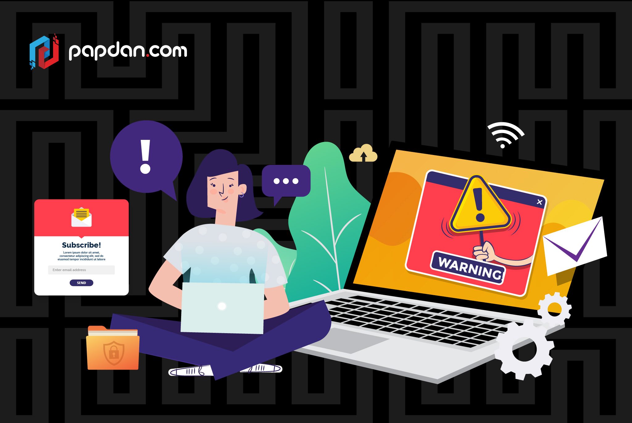
That is just one example of ‘dark patterns’ in web development, which are usually used to refer to deceptive user interface elements that are designed to trick users into doing something they never meant to do. You can see here why businesses tend to do this most of the time since it directly benefits them, aren’t illegal (yet) and it’s quite likely that users won’t be able to notice them until they’re far too late. Of course, now that the world has shifted their stance on big tech companies, these ‘dark patterns’ are being put under the microscope.
Examples of dark patterns
In the world dark patterns, the automatic renewal process is referred to as forced continuity. You know how some websites offer subscription packages with varying periods of subscription? It’s typical of businesses to offer longer subscription at a discount but what people aren’t always aware of is that usually, automatic renewal is in place and this information isn’t always made clear. Some websites will go beyond this by making it hard for users to turn off automatic renewal, usually by burying the option under a lot of menus and obtuse language.
People tend to stick to the default options so by making automatic renewal the default option, there are a lot of companies out there that uses this trick to boost conversion, even if this is only useful for the short term. One other trick is by using double negatives, where users have to tick a box to opt out of something instead of the other way around. Let’s say you just signed up to a website and at the end of the registration process, you’re being offered the option to receive newsletters from the company.
Common sense would dictate that this is something that you have to opt-in first but ‘dark patterns’ flip this idea around and makes this the default option so if you don’t want to receive any newsletter, you have to make the decision to opt-out by ticking the box provided to you at the end of the sign-up process. However, the website tries to obscure this fact somewhat by making the fine print smaller than it needs to be. So the user reads some choice words, like newsletter for example, and chooses not to tick this box even though they actually have to tick this box if they DO NOT want to receive any newsletter. In ‘dark patterns’, a tick, commonly a symbol of affirmative action actually means no.
Why is this important for businesses?
It’s simple, because the trust between the public and tech companies is probably at an all time low. Google, a company that has undoubtedly helped us with their ubiquitous, and powerful, search engine was fined a record €50 million by France’s data protection watchdog, CNIL, for, as per The Guardian, “failing to provide users with transparent and understandable information on its data use policies”. The issue of consent is of particular importance here as by engaging in these ‘dark patterns’, Google made it hard for users to opt out, not opt in, from Google’s effort to collect out data, which is central to Google’s advertising revenue.
I might be grasping at straws here, but I see striking parallel between the issues of consent here with the issue of consent that is also the topic in the rise of the #MeToo movement. ‘Dark patterns’ made it hard for us to say no because we don’t always know what are we being asked of or that we’re actually being asked in the first place. The issue of ethics and transparency will be more prominent in the future as more and more of data becomes monetized so to build trust, it’s important for businesses to shy away from these shady practices and be upfront to customers and potential customers.
