
Early on in 2018, a viral story began trickling in from America about the Tide Pods challenge. Just like the ice bucket and bottle flipping challenge that came before it, the Tide Pods is a fad involving someone making a recording of themselves doing something that’s described in the name. Unlike the other two however, the Tide Pods is particularly dangerous because it revolves around eating the titular Tide Pods, which is a brand of laundry detergent pod from Procter & Gamble that just happens to look appetizing.
The fact that the Tide Pods challenge went viral isn’t actually surprising; cases of accidental consumption of Tide Pods were already somewhat common even before the fad started. If you’ve ever had a kid, you know getting them to keep their hands away from anything bright and colorful can be difficult. I’m not telling you this for nothing, P&G might’ve made a mistake in designing Tide Pods that way but they hold a lesson for the world of web development in how developers and designers should design their call-to-action buttons.
Please, touch anything you want
In web development, just as with video games, clickable buttons are the users’ main method of interaction and despite their seemingly humble upbringing; they’re a very important element of your interface. For example, despite where you might stand on the video game debate, you have to admit that Sony’s design for their gamepad is far more distinctive than Nintendo or Microsoft, and the iconic circle, cross, square and triangle design is as recognizable as the name PlayStation itself.
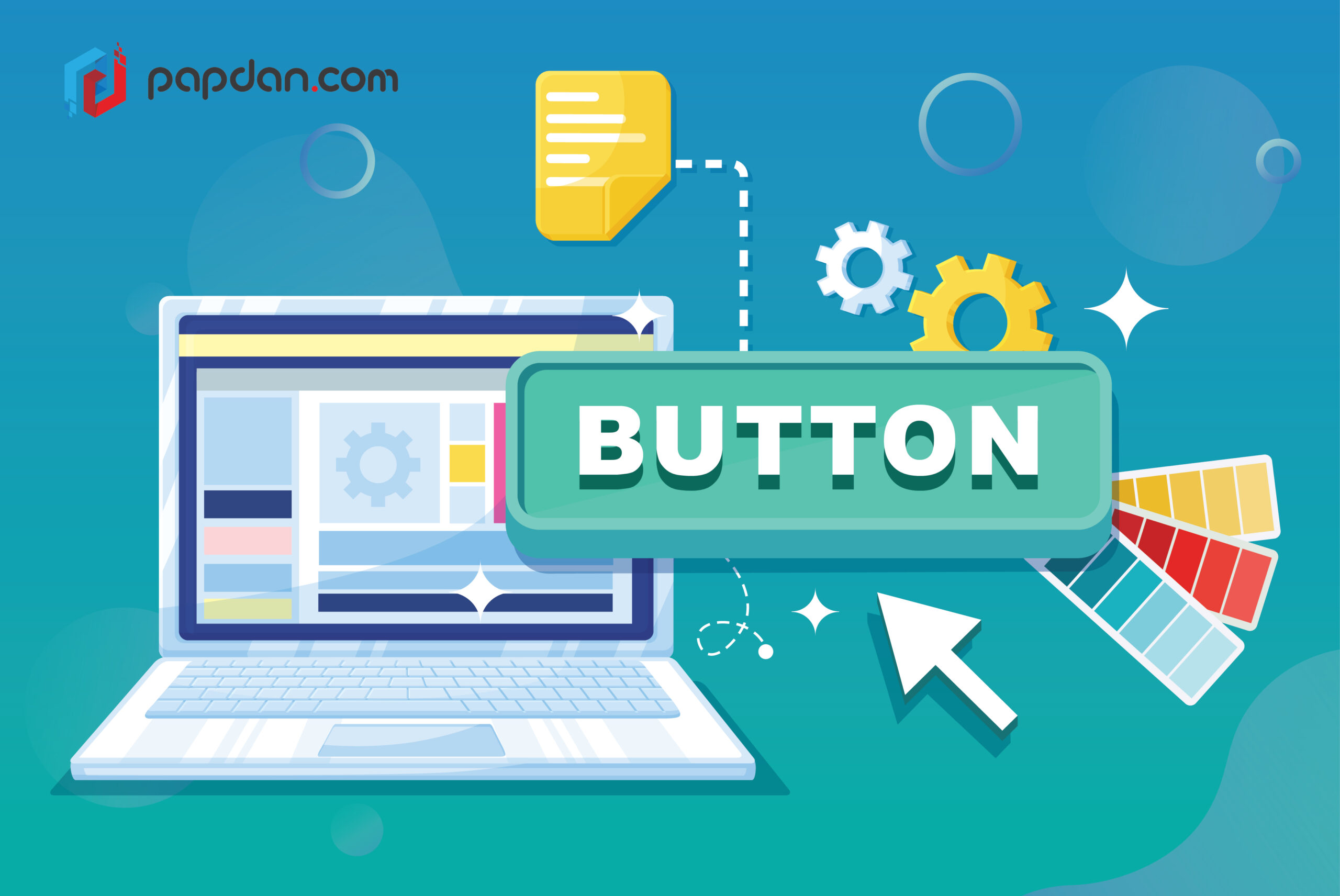
Designing buttons, especially call-to-action (CTA) buttons, is actually a pretty difficult task because they don’t just have to look attractive, they have to look prominent without being distractingly annoying and inviting without being desperate. How do you design something that fits with the overall design but would still be able to catch users’ eye? That, ladies and gentlemen, is just one question that web developers have to regularly contend with when trying to design CTA buttons.
It’s not just the button that’s tricky; the text written in that button has to fill all of the same requirements even with limited space. CTA buttons exist in that rarified air that is the intersection of aesthetics, sales and marketing and crafting something that could sufficiently fulfill all three requirements is far harder than coming up with something that simply looks good. It’s hard but it’s not impossible and as a starting point, you could use the following tips to help create better buttons for your website.
Make it obvious that they’re buttons
Every element from any kind of website can be categorized into two types, passive elements and clickable elements. Passive elements aren’t interactive but aren’t necessarily static, they just don’t require any kind of user input. Clickable elements on the other hand, wait for users’ input to perform whatever it is they’re supposed to perform. Clickable elements can reveal additional elements, take you to other pages, manipulate other elements on the page, etc. The first thing you have to do is clearly differentiate between these two elements in your webpages.
I remember the first time I picked up a PlayStation 2 gamepad to play Metal Gear Solid 2 and I was momentarily confused by the existence of the L3/R3 buttons. The old PlayStation gamepad only goes to L2/R2 and since the then-new gamepad didn’t sprout an additional pair of shoulder button, I was flabbergasted to what exactly are the L3/R3 buttons. It wasn’t until I read the manual that I found out that the L3/R3 buttons are the pair of analog thumbsticks which are apparently clickable.
The moral of the story is obvious; you need to make sure that the clickable elements from your website are immediately recognizable from the get-go. Use appropriate visual signifiers such as contrasting colors, the size and shape of the buttons, shadows and the surrounding areas to make the buttons more prominent. In desktop this is less of an issue because the mouse pointer could transform when users hover over something clickable but this is an issue in mobile where there’s no way for users to check for interactivity unless they tap on it and they can get understandable frustrated when they’ve tapped on something that turns out to not be clickable, or vice-versa.
Include visual and/or aural feedback when interacted
Using both visual and aural feedback is ideal but since it’s not uncommon for people to put their devices on mute, including visual feedback is a necessity if you can only choose one. Consider how you would feel if elevator buttons don’t light up once you’ve pressed them. How are you supposed to know the elevator is on the way to pick you up if there’s no visual feedback? The same line of thinking also extends to website buttons and even if it’s small, you always have to make it clear to users that the buttons have already been clicked.
Put buttons where they can be easily found and seen
When users first time scan your page, you want to make sure that they can easily spot where the CTA buttons are from a simple scan of the page. Making them visually distinctive is one way of achieving that and one other way is to put them somewhere obvious. For example, putting them in the middle of a dense text can lead to buttons being mistaken for highlighted text instead of just buttons. Remember, users might not always be able to actually read the buttons during an initial scan of the page so surrounding them with ample whitespace and putting buttons where they can be easily found is a necessity.
Label buttons with their intended action
The above sentence means that you should try to never use generic terms such as ‘Yes’, ‘No’, ‘OK’ and/or ‘Cancel’ as your button labels. If the buttons involve a binary option, you could label one of them with generic terms but never on both. Additionally, if one of the buttons involves a critical and irreversible action, you might want to use the color red to signify the severity of the situation. In any case, you want to make your button actions as unambiguous as possible while using the least words, so think carefully.
