
When I was still working as a network engineer many, many moons ago, every now and then, I’m asked to sit in meetings between my company’s account executives (AEs) and prospective clients to provide technical know-how. As I spent two years in that position, I got to know quite a bit of AEs and how difficult their job can be. I’m far from being a people’s person so a job that requires you to constantly sweet talk and woo people sounds like an absolute nightmare.
What I learned most from my conversation with them is that even after all the negotiations and presentations, getting prospective clients to actually sign on the deal can be really hard. It’s easy to say you want this and that for your company but once you’re faced with the actual number, which was never small in my case; things are nowhere near as straightforward. This difficulty in closing the deal is not just limited to traditional sales; the world of web development also faces the same problem when it comes to e-commerce.
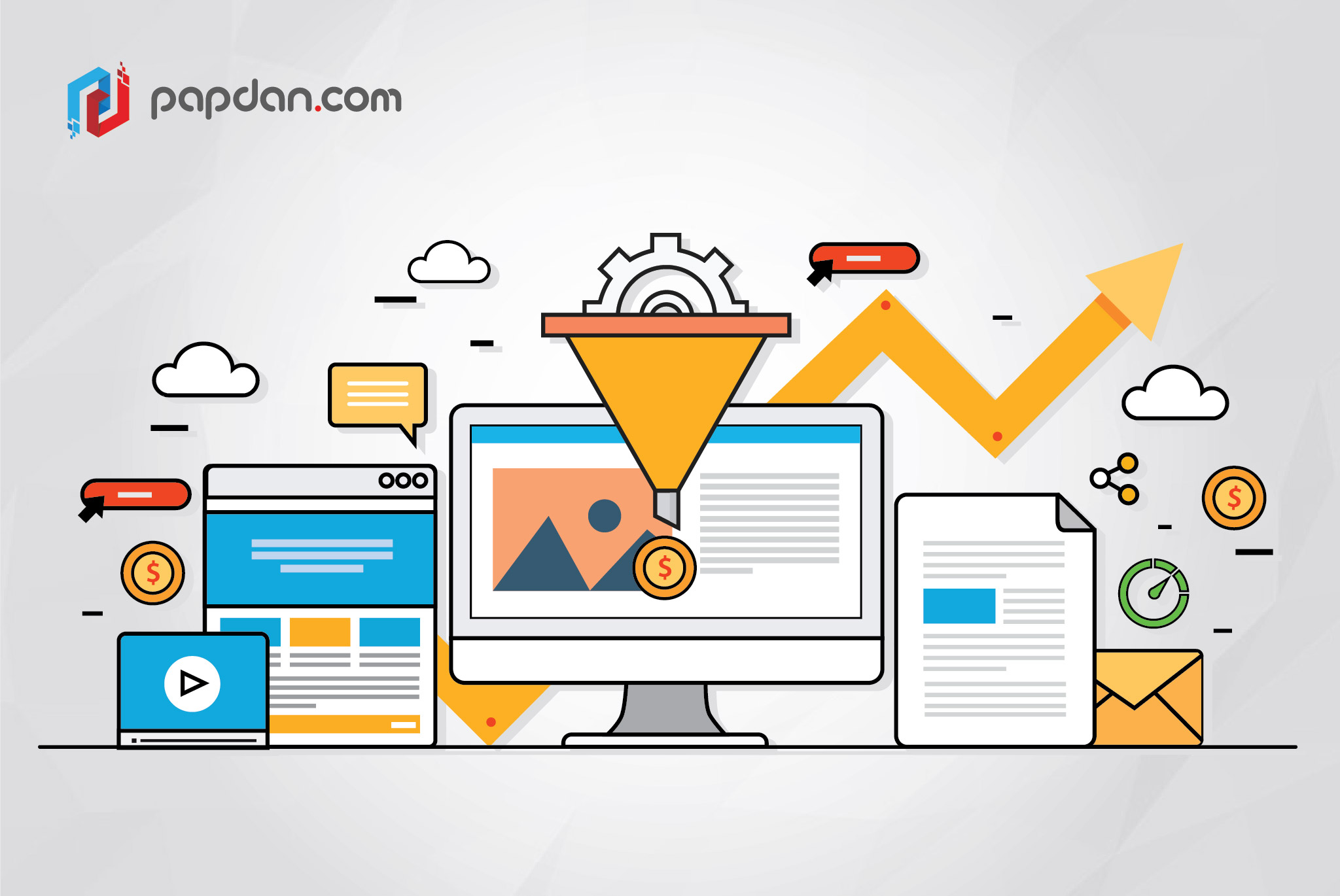
Getting them to sign on the dotted line
It’s a bit too in-your-face to say this outright, but web developers and designers should always keep the issue of conversions in mind when designing their website. There’s this common misconception where businesses tend to consider sales as something to be dealt with at a later time instead. Even from simple conversations with my former AE colleagues, the common thread among the successful ones is that they’ve laid the groundwork very early on in the negotiations.
Developing websites for conversions is far more than just making it look good, it delves both into the technical and psychological designs to gently nudge visitors into becoming actual customers. It’s a bit like how Ikea’s labyrinthine store layout is designed in such a way that visitors are encouraged to look at the various things Ikea has on offer even though they were originally to pick up just one item. The beauty of Ikea’s trick is that it’s subtle and subliminal, which can be particularly effective trait when it comes to conversion.
Ikea’s trick is a masterclass in the show, don’t tell philosophy. Instead of telling visitors to buy this and that, Ikea simply devises a way to let visitors see their product and let the product speaks for itself. Impulse buying is very much a real thing and Ikea takes advantage of this to get people to buy things they might not necessarily need right that moment. There are other similar subtle things you could use when it comes to web development to achieve the same effect, which will be detailed further on.
Use the principle of encapsulation for your call-to-action (CTA) button
Even if you have no interest in photography, you should at least be familiar with the ‘bokeh’ effect that’s pretty much all the rage in smartphone cameras over the past few years. The word bokeh comes from the Japanese word boke meaning blur or haze and the bokeh effect is shorthand for the tasteful and intentional use of blur and other out-of-focus effect as an aesthetic quality. While the use of this effect used to be reserved for cameras with very wide apertures, smartphones with more than one camera is capable of emulating this bokeh effect.
Bokeh is mainly used to give a subject more focus and it’s also why bokeh is very popular in macrophotography. I’m not suggesting you blur other parts of your website to make your CTA more prominent but you can give your CTA more focus by using the principle of encapsulation. For example, you can put your CTA button inside a container to further distinguish it from other elements. This is much more preferable compared to making your CTA button bigger or adding more exclamation marks, which can be annoying and make you look desperate.
Don’t overwhelm your users with options at the beginning
Hick’s law is one of the most quoted principles when it comes to UI design. Named after British psychologists William Edmund Hick, Hick’s law posits that the time it takes for a person to make a decision is dictated by the amount of options available. The more time someone has to ponder over a decision would also give that someone more time to back out of the deal, which is something you should always avoid. Variety might be the spice of life but too much spice can also leads to over-seasoning.
When it comes to conversion, you don’t want to overwhelm your visitors with options, or at the very least, not at the beginning. The reveal of options should be gradual and in steps. This is an important consideration when you’re working on landing pages, which should be as simple and straightforward as possible so as not to overwhelm visitors. What you must always remember is that I’m not advocating for the removal of options, I’m trying to say that users should be eased and guided into these options gradually.
Only ask for necessary information
Data privacy is now a very real concern and it’s understandable that the general public is now somewhat hesitant when websites are asking for their personal information. The solution is simple; unless that information is necessary for your customers to conduct business with you, don’t ask for it. Doing away with unnecessary information also has the added benefit of making your forms shorter, which is something that holds universal appeal.
