
This is probably because I’m such on a Disney kick after finally, finally getting my grubby little paws on Kingdom Hearts 3 like, 15 years after Kingdom Hearts 2 came out, but can you imagine being one of the people who got to see Steamboat Willie in theaters back in 1928? Steamboat Willie wasn’t the first cartoon ever made, nor was it the first to be made with synchronized sound effects but it was the first one that attracted popular attention, raising both the popularity of Disney and Mickey Mouse.
It really isn’t hard to see why Steamboat Willie became such a massive hit, cartoon or animation or whatever you wish call simply captures your attention, whether it’s in video games, films or on your television screen. In the 21st century however, we’ve seen animation making more and more appearance in the world of web development in the form of motion graphics. They’re not as frantic as cartoons but even employing them in small doses could go a long way in making your website more attractive.
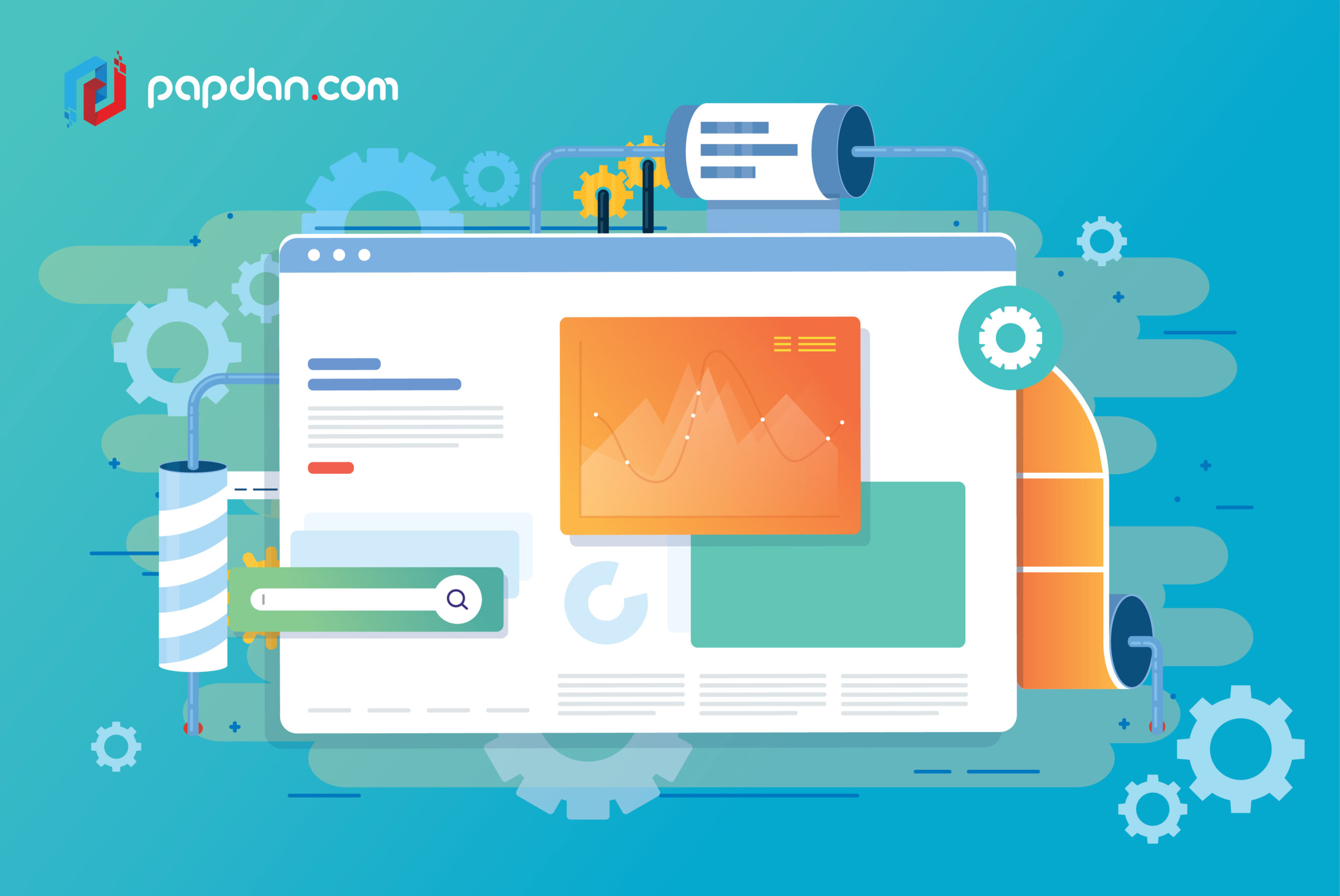
Website in motion
The easiest example of using animation in website and one that we’re probably all already familiar with is the Google doodle. I’m 99.99% sure that those of you reading this will already be familiar with the Google doodle but in the teeny, tiny chance that you belong in the 0.01% that don’t, here’s an overview. On special days, the Google logo you’d normally seen in Google’s homepage will change to reflect what the special occasion is.
These doodles can range from simple static images like the one displayed during the World Cup festivities in 2018, simple animations like the one during the solar eclipse of 2016 or in very special occasions, an actual minigame you could play like the one from Computer Science Education Week in 2017. Static images are great but they can be a bit dull and while the minigame one is really fun, it can also take a little bit of work. Animations on the other hand are relatively simpler to make and they can be incredibly versatile.
The Google doodle example is purely decorative, it’s there just to give users something nice to look at for entertainment purposes but simple animations can also be used to inform users of what’s happening on screen. For example, while users are waiting for your page or contents to load, why not add an animation indicating how much has been loaded in terms of percentage while throwing them a cute animation they can’t keep their eyes out of?
The website for Creative Cruise, a gathering event in Amsterdam for people working in the creative industry, uses a simple animation of a person flapping around while the page is loading with the progress shown with a number under the animation. The website itself is also prominently features animation, showcasing people randomly doing things on the typical Amsterdam canal. This is fine if you’re just doing motion graphics for fun, but if it’s for a functional purpose, there are things you have to keep in mind when using animation for your websites.
Try not to overwhelm your users
Video game arcades are sadly a dying breed but when I was growing up, I spent a lot of time playing those light gun games. The older readers would probably remember them as Duck Hunt while millenials like me would be more familiar with the 90s incarnation, Time Crisis. The sad thing is, even though I love Time Crisis, I’m unarguably bad at them because I get very nervous when the enemies and bullets start to overwhelm me.
The thing is, when you start to have plenty of movements on screen, it can get very overwhelming. This is fine in a light gun game since the whole point is to not make it easy for the players and challenge is part of the fun after all but when you have too much animation on your websites, it could prove to be a distracting experience for your users. Animation is supposed to be used to call attention to whatever it is you’d like to showcase but when there’s too much to focus on, what do you think users are going to do? Leave, that’s what.
Focus on animating one element at once and to make sure that there’s a time gap between animations to save users from having to play whack-a-mole with your website. In web development, there’s a term referred to as the hero element, which is a piece of design that acts as pièce de résistance of any given page. If you’re thinking of focusing on just one animated feature, try to use it on your hero element.
Try to think of motion from the first planning stages
The mistake I tend to see is that animation and motion graphics can feel like somewhat as an afterthought, as if you were designing a page without animation at all but once you take a look at the end product, you feel like it’s a bit too dull and could use something extra and in comes the animation. The problem with this way of using an animation is that it can stick out like a sore thumb.
I understand it might seem contradictory to what I say about hero element earlier but animation can prove such a game-changer to user experience that unless you design the entire page with animation in mind, it could actually ruin the entire experience. If you think I’m being hyperbolic, ask anyone who’ve used Microsoft Office in the late 90s what they think about Clippy, the animated assistant available to Office users.
