
This is going to sound weird, but do you know what a carousel is? Carousel, also known as a merry-go-round, is a mainstay of theme parks everywhere. It’s as inseparable as roller coasters are to theme park, and yet, perhaps because carousels are seen as much lamer when compared to roller coasters or ferris wheels, you’d be surprised at how many of the Tik Tok (née Musical.ly) generation doesn’t know what a carousel is.
Interestingly, there is also another reason why people might not know what a carousel is, or rather, the carousel as we all know and love. For those of you with a more than passing familiarity with web design, the word carousel actually has a different meaning. Carousel, also known as image sliders is a trend in web design that could be used to display several images on the same space through the use of a rotation scheme.
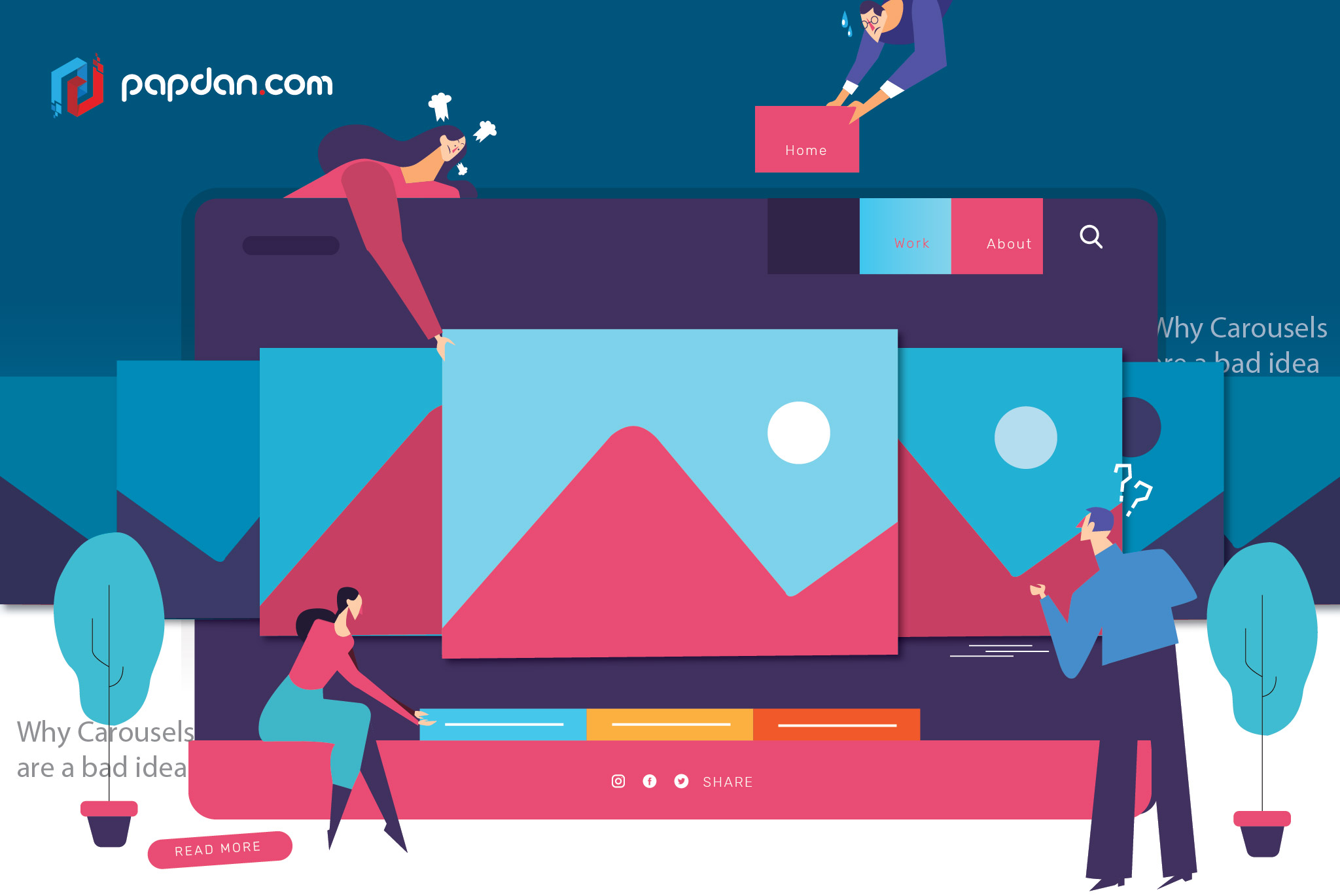
Carousel image displays
The name carousel comes from the fact that the images are displayed in something like a carousel. You only see one image and that when the carousel rotates, you can see another image and so on until you arrive back at the first image. Unlike one you might find in Disneyland however, the image carousel doesn’t always automatically moves, and it is usually common to add a button of some sorts to manually slide to the next image, which is where the name image sliders come from.
If you’ve ever been to any e-commerce site then you should’ve seen image carousels at least once. Amazon has one prominently displayed in their homepage for example and well, if Bezos think that they’re worth using, who are we to say otherwise? The problem is, just because you could, it doesn’t mean that you should. Not everything that’s popular are good, some, like YouTube’s most popular channel, PewDiePie is downright awful. If you still need more convincing, here are 4 solid reasons why image carousels are a bad idea.
They tend to get overlooked
Websites homepage is like a tollgate, people generally don’t spend time on there any longer than they have to. This is why it’s not uncommon for the other images to be missed. Because it takes time for the next image to slide over the current one, it’s entirely possible for visitors to your website to completely miss the fact that there are other images in the pipeline. Even if you add arrows to the carousel to indicate that there are indeed other images, it’s still not a guarantee that your visitors are going to notice.
The worst offender is the carousel where the sole indicator is a row of white circles at the bottom of the image. It’s nearly impossible to tell that the circles aren’t actually a part of the image and that those circles represent the number of the images that are in the carousel. I was actually surprised that those circles are clickable, which would take me to the corresponding image in the carouse. That is simply bad design.
They tend to not play well in mobile devices
Given the way the world has been moving in the past few years, it should come as no surprise that we’ve now officially jumped the shark; mobile internet traffic has officially surpassed desktop internet traffic. As such, your focus now should be on optimizing your website for mobile. Image carousels are surprisingly tricky to implement, from warped text, misaligned images and the fact that it can take a long time to load, which would be explained further on.
They can be quite slow to load
Another thing that is of the utmost importance is page load speed. Mobile internet, despite advancements from 3G to 4G and pretty soon, 5G is still neither as reliable nor as fast as a fiber-optic connection. Where you are and the density of the people piggybacking on the same frequency around you affects how fast your mobile internet is. Try uploading a video in the middle of the crowd during Splendor in the Grass or Laneway to see what I’m talking about.
The issue concerning image carousel is two-fold. First, it requires more code to implement, obviously, which takes that extra amount of things to process. The other issue is that when it comes to image carousel, know that your homepage is going to load four or five pages even though your visitors are only going to be able to see one at a time. That’s more work for benefits that might won’t even materialize in the first place.
They are annoying and dilute your message
Imagine reading a book that turns its page by itself and try to think of how annoying it would be if the book turns to another page even before you’ve finished processing the current one. That’s what image carousels are and they’re incredibly annoying. Instead of offering four or five messages in short bursts, focus your attention on just one and use that inside a static banner. Image carousels might leave your visitors confused and that’s something you definitely do not want.
