
Few sentences are as loaded with falsehoods as ‘going on a quick trip to Ikea just to pick up a few items’. There’s no ‘quick’ trip through Ikea’s labyrinthine layout and it’s quite unlikely you’ll be picking up just ‘a few items’ once you’re lost in the maze that is the Ikea store. This conceit is obviously by design, made up so that visitors to the Ikea store spend the maximum amount of time inside the store with the temptation of impulse purchases dangling around them.
With the continuing growth of online retail, the million dollar question businesses have on their minds is how to transplant those advantages into the digital space. With no physical location and products to speak of, gently nudging potential customers to stick around and tempting them with impulse purchases is going to be slightly difficult. This is where a good website could help you. With proper web development and design, it is actually possible to replicate the same effect the Ikea store has even if you’re limited to a computer screen.
Websites for businesses, not just for e-commerce
Even if you don’t work in retail, having a business website is still highly advisable. As the public increasingly turns to the internet for almost everything, not having an online presence would be akin to not existing at all. Sure, you might think that having an Instagram and a Facebook account might be enough but the confines of those platforms would mean having to deal with limitations on how your business would be portrayed.
Think of it as the difference between living in a dorm and having a place of your own. In a dorm, your decorations and furniture options are limited and if there are nights in which your sleep is disturbed by a keg party next door, that’s just part of the parcel. With a place of your own, you could design it however you see fit and if there are disruptions in the neighborhood, you could at least file a noise complaint.
Of course, that complete freedom came with an abundance of choices and for those of you who’s just starting out, having that many options can be overwhelming to begin with. To help alleviate this problem, here are some basic tips you could use as you start the process of developing your own website.
Have a clear concept in mind
The famed philosopher Sun Tzu, in his endlessly quotable book The Art of War, states that “victorious warriors win first and then go to war”. In the context of war, this would speak to the benefit of going into battle with enough strategy and preparation that you’d be prepared for any eventualities. Applied in the context of life in general, this quote could be taken that for every venture you’re partaking in, preparation is the key to success.
Before you start building your website, ask yourself what that website is going to be used for. Is it going to be an e-commerce site? A place where you can showcase your work akin to a portfolio? Or is it simply a place for visitors to gain information like a blog? This basic choice of what you want your website to be like will inform every other following decision you’re going to make so consider this point carefully.
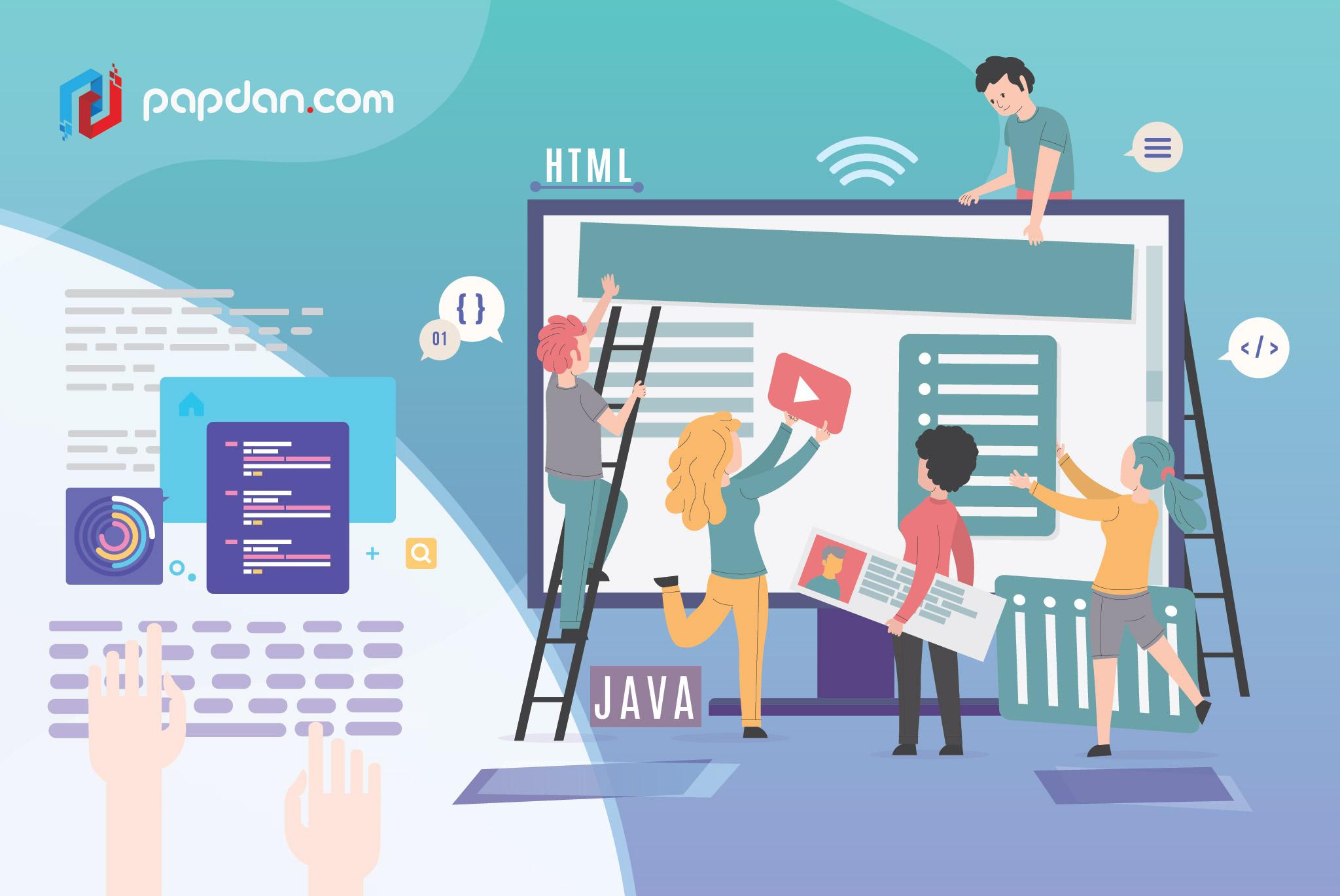
Focus on the basic structure and navigation of the website first
Ikea might be able to get away in designing their stores like the Minotaur’s labyrinth but on the internet, where people can simply escape by closing the tab or the browser, poor navigation isn’t something you could get away with. Before you jump into the complicated world of webpages and visual design, focus on the foundation and the navigation of the website first. Think about it, when you’re building a house, the first thing to do is to divide the actual building into rooms first and websites are basically the same.
Work on the main sections of your website and how are they connected to each other. The header and the footer together with the main navigation bar should serve as the common element within your website, visible across every page, which means that you should work on that straightaway as well. Additionally, make sure that going around from one section to the other is as painless and with the least amount of clicking possible.
Make use of negative space and minimalism
Here’s one thing that you could take out of Ikea’s playbook; minimalist design. This is especially important if you’re running an e-commerce website as the amount of information being displayed by default would be massive and any extra distractions might overwhelm your users. In visual design, there’s the concept of negative space that relates to the use of space in between elements, such as the famed NBC peacock.
Always show recommendations
A similar concept to impulse purchases that exists in the internet is the one we like to call as the Wikipedia wormhole. You know how in Wikipedia, internal links are always highlighted in blue and then when you’re reading something in Wikipedia, you’re always tempted to click on those links whenever there’s something you don’t quite understand? That’s the Wikipedia wormhole, where a quick read on the new Charmed reboot led to me reading the entire plot of the movie Heathers, which I still haven’t watched.
You could do this by displaying internal links within your articles and by showing users a list of recommended and/or similar articles, or products if it’s an e-commerce site, within the page. This would subtly encourage your visitors to spend more time within your website if the first one was a hit. Keep in mind that more of the same will only work if it was good in the first place so you might want to focus on the quality of your contents first.
Additional notes
The common misconception is that the website functions as a marketing platform, playing host to contents that could be used to popularize your brand. The truth is the website itself can be used as a marketing tool. How well it looks and works could be used as a barometer of quality for the company behind the website, which is why you should focus on both the content and the website itself and the 4 tips listed above should help you with the latter.
