
For a completely unrelated reason, the racing video game series Mario Kart, or specifically, a character from the game, blew up all over the internet a couple days ago. Stephanie Clifford, known professionally and popularly by the nom de plume Stormy Daniels and one of the women that allegedly had an affair with President Donald Trump, revealed in a tell-all book that Trump’s *ahem* private parts, resembled Toad, the anthropomorphic mushroom character from Mario Kart.
The discussion of completely ruining a beloved childhood artifact aside, this brouhaha did leave me feeling nostalgic of childhood’s memories of crowding over at a friend’s house playing Mario Kart together in a single TV. Online gaming was non-existent limited 2 decades ago and split screen multiplayer was the standard practice. In 2018 though, online multiplayer is the norm but the beauty of the split screen itself still endures in the world of web development.
Split screen in popular culture
Other than its use in the pre-online multiplayer world of video games, split screen is also heavily used in film production. In the 2009 film 500 Days of Summer, the split screen technique is used vertically to shine the differences between the main character’s expectations and reality. In the 2003 film Down with Love, the split screen is more dynamically used to portray two characters speaking over a telephone for various comedic effects and sexual innuendos.
From the two examples above, it can easily be surmised that split screen is at its most effective in showcasing two elements or highlighting the connection between the two. In web design, we often talk about using minimalist design in combination with a hero element, so as not to overcrowd your webpage by focusing on one element alone. Split screen can be used to overcome this by essentially splitting your webpage into multiple sections.
Split screen is quite versatile in that it could be used either vertically or horizontally which are the most conventional ways to do it or diagonally. Thanks to its versatility, split screen can both be adapted in both landscape and portrait viewing, i.e. for both conventional widescreen monitors and diminutive smartphone screens. That being said, there are still instances where the use of split screen can be most effective, as detailed below.
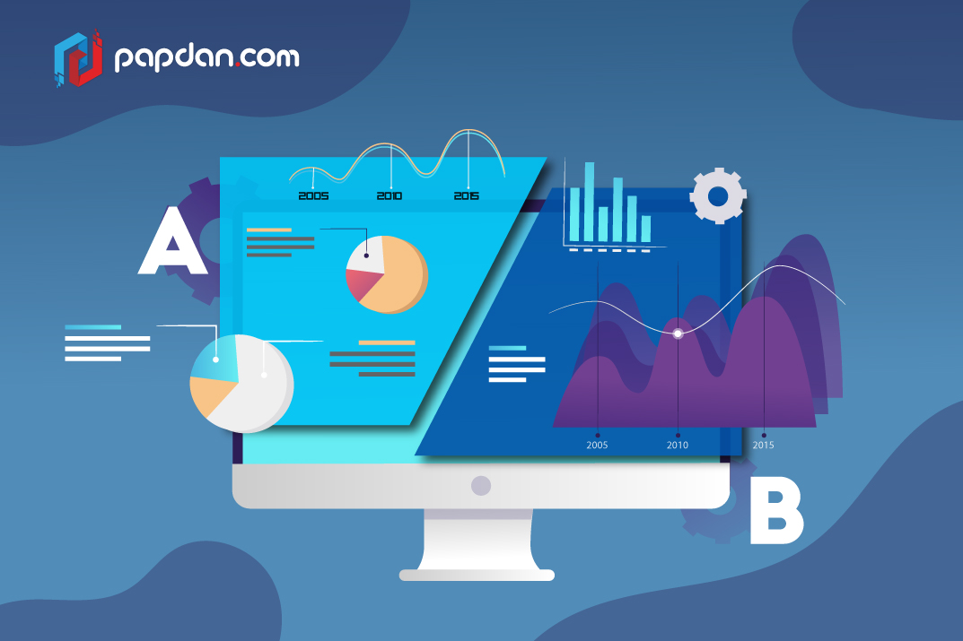
To provide an illustration for texts or to provide context for an illustration
One of the most common uses of split screen is to put an image on one side and textual content on the other side. This plays up the duality and the contrast between the two while still providing a connection between them. Additionally, this would also save you the trouble of having to find somewhere to overlay the text over your image, which has the potential of reducing the impact of said image.
Use subtle visual cues to indicate a connection between the two screens
If you’re using the split screen technique for the above reasons, it is advisable to include a common element within the two screens to indicate a flow from one screen to the other. You could for example, include an element of the image that ‘bleeds’ into the next screen or use a headlining text that encompasses both screens. Other useful ways of achieving this include using similar color combination between screens or by having the image span across both screens but with a colored overlay in one side.
To illustrate two contrasting choices of your products and/or services
Let’s say for example you’re a clothing company that focuses on formal wear for both men and women. With this information, you can design a landing page where one side of the screen is dedicated to men’s wear, perhaps featuring a male model in a tux while the other side of the screen is inhabited by a female model in an evening gown. That is just one simple example but if your business can be widely categorized into two binary choices, you can use split screen to equally highlight both of them.
Don’t use split screen for every page of your website
Just because they’re versatile and aesthetically pleasing, that doesn’t mean you should use this technique on every single page of your website. While you could technically split your webpage into more than two parts, since split screen is essentially an oversized card, it’s not especially useful for a page that hosts a lot of content. Remember, splitting your screen forces users to also split their attention, which is why it’s not effective when used in a page with lots of contents.
Just because you can doesn’t mean you should. As with all things in life, use split screen in moderation.
Closing thoughts
Before we part, I would like to point out that there has to be a connection between the two halves for a split screen web design to work. Even an either/or choice also imply a connection but if you’re just simply throwing things side-by-side because they look good, it won’t work as well. This split screen technique is just another trick in the repertoire of web design, it serves to prop up your contents, figuring out the best way to present them and as such, you still need to focus on your contents first.
