
In modern web design, the issue of typography is usually limited to the decision on which typeface to use. If you’re designing a room, it would be akin to obsessing over what paint colors to use with little regards to everything else. That is to say, yes, the decision on which typeface to use is important but when it comes to typography, there are other finer details that might seem irrelevant by comparison but added together could actually make or break your website.
In the field of typography, we refer to these finer details as typesetting. If typefaces refer to the visual aesthetics of a given text, typesetting refers to the technicalities behind how that text is displayed. If we’re building a house, typography would be the architect, designing how the house would like while still incorporating usability factors while typesetting is the civil engineer, making sure that the foundation and the structure of the house works as well as it should.
Typesetting and typography
Do you know why Africa is still suffering from extreme poverty even with all the foreign aids the world has poured into the continent over the years? That’s because even well into the 21st century, Africa still lacks the proper infrastructure to support the distribution of those aids. Foreign investments into infrastructure don’t make good headlines the way food and medicine donations do.
This lack of sexiness is also why typesetting tends to be overlooked compared to the snazzy typography. In the heydays of print publications, typography and typesetting used to be completely separate. Newspapers and magazines employ someone whose responsibility solely revolves around typesetting, that of the printer compositor. Despite being mostly uncredited, a compositor’s work is crucial, making sure that the readers would have no problem in reading large blocks of small text common to newspapers.
With the shift from print to digital however, typesetting could be considered a fading art. Because web design is now mostly handled by graphic designers, a group of people who tend to not take much consideration if any, into text composition, the process of typesetting is mostly left to word processing software. While the gritty details of typesetting can be highly technical, there are 4 basic tips you could use to optimize reader’s experience.
Choosing the right amount of line length
The key lies in balancing just the perfect amount of characters in a single line of text. Too short and there would be too much switching back and forth on the reader’s part, which disrupts the natural flow of your writing. Too long would render the text too spread out, which could lead to problems in focusing. For desktop pages, the optimum length falls somewhere around the 60-75 mark while for mobile devices, it’s usually half that amount, around 30-40 characters.
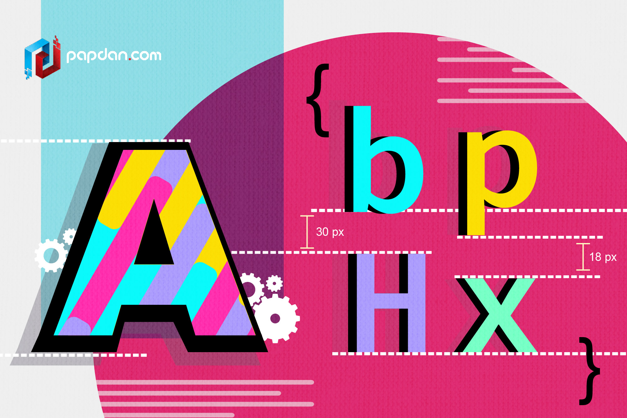
Leading, kerning and tracking
In the field of print typesetting, this space between the lines in body of text is referred to as leading while in web design the same subject is referred to as line spacing. Kerning on the other hand refers to the space between individual letters. Tracking is similar to kerning but it dictates the space between each letter in a single word. Once you’ve set the proper kerning for each letters, you can use tracking to essentially stretch the word as a whole while still maintaining the individual kerning ratios of each letter.
These three concepts refer to how we manage the detailed spaces between and inside the text. Line spacing would be familiar with everyone who has ever used a word processor and the same considerations could be applied here. Optimally, line spacing should be set somewhere around 130% with 150% or 1.5 lines being the absolute maximum. Kerning is much trickier since it differs from typeface to typeface. Tracking is usually used as an aesthetic touch, to give emphasis on certain words by giving them more air, so to speak.
Horizontal and vertical scale
In a typical document setup, whenever we want to enlarge a part of the text, we simply increase the font size by a point or two. While this method is good enough for basic use, there are times when we want to alter or emphasize a certain world without that word dwarfing over the others. For those occasions, we modify the horizontal and vertical scale of the text.
In layman’s terms, horizontal and vertical scaling refers to the practice of stretching a text without maintaining the same ratio. By manipulating the horizontal and vertical scale, the text could end up slightly narrower or wider. Used excessively, this scaling practice could lead to severely distorted text but used intelligently, you could modify the minute details of a certain text however you see fit.
Having sufficient color contrast
This was never an issue with newspapers since the text are exclusively rendered in black with white backgrounds. In web design though, making sure that your text stand out when compared to the background is important. Keep in mind however that contrast ratios has a subtle effect on how humans perceive things. Low contrast ratios tend to give off a cooler atmosphere than high contrast ratios.
For contrast ratios, the World Wide Web Consortium (W3C) has set a guideline for web administrators. Small or body text should have a contrast ratio of at least 4.5:1 while large or headlining text should have a contrast ratio of at least 3:1.
Typesetting is a thankless job in the way that people tend to not go out of their way to praise good typesetting but a bad one will never escape their attention. Taken in this way, typesetting is what is termed as functional design. The hallmark of good functional design is that it never calls attention to itself. Typesetting is there merely to serve your content, to make sure that the hard work you’ve put into your writing could be appreciated the way it’s supposed to be.
