
How many devices do you use to access the internet? And I mean the internet as in the old-school typing-an-address-on-a-web-browser kind, not the looking-at-honeymoon-pictures-of-your-ex-on-the-Instagram-app kind. A smartphone is I’m guessing a pretty sure bet. Probably on a computer or a laptop as well. Perhaps on a tablet? Or you might be one of the peculiar ones who use the web browser on your smart TV set. I once sat with a friend who opened a web browser on their smartwatch just to prove a point. My point is, the internet has been democratized to a point that as long as something comes with a screen there’s a 90% chance that it will accommodate a web browser at some stage.
Don’t believe me? Smart speakers are now equipped with a screen. The rise of standalone affordable VR headset like Oculus Go is poised to make VR accessible to the mainstream and a project for a VR browser is already well underway. I honestly won’t be surprised if I walk into a bathroom in Tokyo only to find a smart toilet showing me livescore updates of the French Open. While this rapidly escalating Internet of Things (IoT) phenomenon ultimately is a good thing for the end-users, it is proving to be a head-scratching dilemma for those working in web design. Just how are they going to keep up with this pace of development? The answer it turns out isn’t as clear cut as we would’ve liked with two seemingly similar but distinct solution out in the wild, responsive web design and adaptive web design.
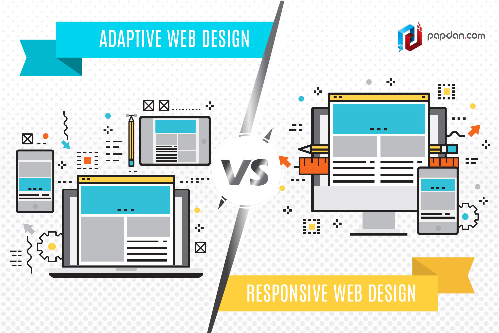
The fluidity of responsive web design
Responsive web design (RWD) is exactly what it sounds like. It’s a practice in which a webpage detects the size of the screen it is being displayed or in the case of a desktop browser, the size of the window that’s open, and adapts itself along with all of the contents on that page to fit that size. Other than the magical fluidity of the page itself, RWD ensures consistency across all devices because it’s still the same page being displayed, only arranged differently. RWD is as of now considered the best practice when it comes to web design and if ranking on Google is of a concern to you, the search engine giant has outright stated that this is the design pattern they recommend.
If RWD’s fluidity sounds like magic to you, that’s not for nothing. RWD’s underlining code is considerably more complex than the average webpage and could easily increase in complexity depending on how your website was actually designed. As such, optimization for RWD could take a copious amount of time and will involve a lot of testing as you evaluate and fine-tune what your page looks like across different devices and resolutions. RWD is usually designed with desktop in mind and as the fluid nature is being handled by the code itself, it can be hard to exercise granular control over how your page is displayed on other devices.
As it stands now, RWD is the popular design choice. Its one-size-fits-all approach means that there won’t be much fuss involved in the long run when new devices start popping out as RWD is built with future-proof in mind. RWD is liquid; it shifts its shape to fit in whatever container it’s currently sitting on.
Adaptive web design caters to specific devices
By contrast, adaptive web design (AWD) serves up several fixed layout sizes depending on the screen size the page is being displayed. Unlike specialized mobile sites that use different URL for mobile sites (m.example.com instead of example.com), AWD still uses the same URL but generates different versions of the HTML page depending on the data sent by the user’s browser to the server. As you’re free to specifically design layouts for as many devices as you want you can tailor each layout to the best of your liking. AWD sacrifices consistency to ensure the optimal experience for each device which is a good thing but it could prove to be a jarring experience if you constantly switch between different devices.
If you’re thinking that preparing fixed layouts for different devices sounds like too much work, you’d be right. The code itself isn’t as complex as the one with RWD but the amount of work you have to do linearly rise with the number of layout you’d like to prepare. Remember, screen sizes aren’t the only thing you’d have to accommodate; you also have to consider different resolutions. Smartphones come in HD, Full HD and Quad HD for example. Even when that’s done, it’s not going to be easy in the long run as well since any changes and/or updates to your site will have to be tested and implemented with all of the layouts you’ve prepared. Also, unless you’ve planned for every existing device out there, some are always going to fall through the cracks and will have to do with whatever layout’s the closest.
As the work involved with AWD is considerably more substantial than RWD, it hasn’t seen widespread use. If you’re handling vast amount of web traffic from few specific devices though, going with AWD might be a better option as it allows you to accommodate each platform according to their needs. The retail giant Amazon uses an adaptive web design for example as the complexity of an e-commerce website isn’t suitable for RWD.
Choosing the right approach
This is an either/or decision so if you decided to go with one option only to find that it’s not exactly the right approach for you, trying to switch to the other lane might prove to be a costly endeavor. If you’re just starting out, going with Responsive Web Design is the natural choice as it allows your website to be accessible to anyone without having to optimize for each device. Generally speaking, Adaptive Web Design is best left to those who know what they’re aiming for. It’s pointless to optimize for specific platforms if you don’t know what to optimize for. With more and more novel ways of accessing the internet popping up every day, it’s only natural to adapt your approach to web design to accommodate for this.
