
I like to read. Usually, the first thing that comes to people’s mind when that particular sentence comes out of my mouth is an image of me elegantly sitting in a corner café somewhere with a book of poetry in my hand sipping a cup of Americano even though 8 times out of 10, my reading activity consist of me laughing in a public bus while reading the latest post on Clickhole. I still read literary fiction but with the way the world has progressed in the past decade, you could never be short of reading material from the internet, whether it’s the kind of short, clickbait-ish content that Clickhole is famous for or the kind of longform stories and/or journalism that is common with respected publications.
The way it works for me is that usually while on a break from work, I scour news aggregating apps like Pocket for interesting reading material from my work computer. If it’s short, I read it right there and then but if it’s of a longer nature, I use the built-in save feature to read it at a more comfortable time, usually while I’m sitting in the bus with my phone. Sometimes though, the actual piece I meant to read get warped and distorted in my 5.5-inch screen, which can be especially frustrating if you’d been looking forward to this piece to help relieve you of the stress from work. In the world of website development, one of the ways you could keep this fiasco from happening is with the use of responsive web design.
Ever since Apple debuted the first iPhone back in 2007, basically opening up the internet to mobile devices, one of the foremost goal in web development was to achieve full parity between the traditional desktop web experience and the then-burgeoning mobile web experience. Back then, one of the easiest ways of achieving this was to use a separate mobile-specific domain for mobile web browsers (m.example.com instead of just example.com). For a time, this was enough but then Apple released the iPad, starting the tablet movement together with Android manufacturers and further complicating the matters even more. Do you then design another tablet-specific domain or somehow cobble together a one-size-fits-all approach? And what of the internet-capable Smart TVs? Or the numerous PlayStations and Xboxes that are capable of accessing the internet? Enter responsive web design (RWD).
You must be shapeless, formless, like water
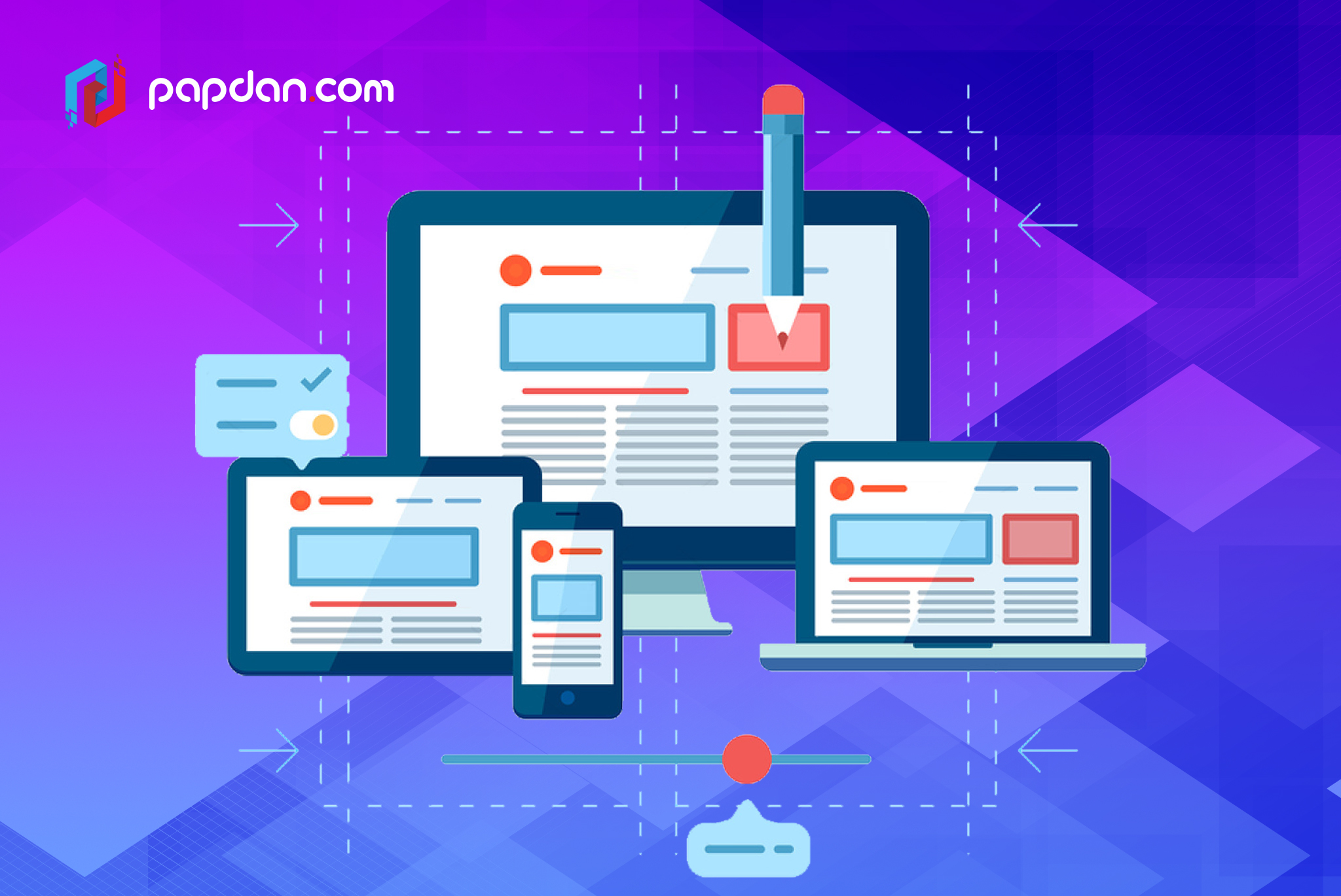
As its name implies, responsive web design is a web development technique where the web page itself detect the size of the screen it is displayed on and fluidly response to the situation at hand. Fluid is the keyword here as RWD is required to act like a liquid substance adapting itself to different containers (screen sizes) and drinking methods (input devices). What looks good on a 24-inch desktop monitor has to look good on a 5.5-inch smartphone screen and what’s easily clickable with a mouse has to be just as easily tapped with a finger on a touchscreen. While the goal of RWD is to ensure parity across devices, there are also other benefits in going with this approach, such as:
- Easier to maintain in the long run
Having separate domains for different devices means having to maintain them simultaneously, this means twice the amount of work or possibly more as you have to manually adapt your content to fit different screen sizes. On the other hand, RWD simply asks you to upload your content while the grunt work will be handled by the webpage itself. Of course, this would also mean that RWD is several degrees more complex than your average webpage but it’d be easier to think of it as an investment. Sure, the initial work would be pretty tough but the benefits and advantages it brings you down the road is priceless.
- Guarantees you a spot on Google’s good side
Google likes RWD and if you’re a business owner who relies on the internet for a living, you should always endeavor to be on Google’s good side. If you’re not, it doesn’t matter because your customers probably do rely on Google in some way or another. Given Google’s somewhat secretive nature when it comes to their search algorithms, it’s not exactly clear whether RWD affects page ranking or not but given Google’s unequivocal support for RWD and the fact that RWD itself is the ideal design for a webpage, it doesn’t hurt to make the extra effort.
- It’s the only development method that is truly seamless
Other than RWD and separate domains, one other approach is by using an adaptive web design, which is somewhat of a middle ground. This uses the same domain but serve different HTML pages depending on the device accessing the domain, so it merely looks seamless. Close, but no cigar. While this isn’t exactly a problem per se, the lack of a truly seamless experience could prove to be a jarring experience. This is purely superficial but adaptive web designs, not to mention separate domains, don’t exactly give your business an air of professionalism the kind RWD do. Sounds a bit hackneyed but there are proven examples in how RWD boosted mobile conversion rates.
As the promise of Internet of Things (IoT) grows more achievable by the minute, the amount of connected devices around you is just going to increase. We’ve already seen smartwatches like the Apple Watch and Moto 360 in the market and 360-degree contents for VR headsets like the Oculus Rift and HTC Vive have started popping out left and right. It remains to be seen whether the way we consume the web right now is still going to stay the same in the next 5 years (foldable smartphone, anyone?) but RWD has always been designed with such future in mind. RWD isn’t the easiest to develop and as it uses a much more complex set of codes than the average website, it could take forever to load if you don’t know what you’re doing so if your web development team isn’t exactly equipped to handle this, it’s best to look for some outside help but one thing is for sure, RWD’s future-proof nature renders it essential as we approach the next generation of web design.
