
Website is a media that is widely used for expanding many businesses. However, many websites are still struggling to come up with good conversion rates. In fact, some web developers find it is hard to create a website that can captivate users and at the same time produce good conversion rates. However a website will not simply bring you more traffic; you should make it work for you, but how?
As a web developer or SEO analyst, you certainly have heard about Call To Action features and how it can affect your conversion rate, right? These elements are keys to your e-commerce success. By cleverly designing, developing, and promoting your content and Call To Action promotions/buttons, you can incrementally produce better conversion rates. Here are some tips to follow if you want to make a design that produces better conversion rates.
Before explaining about how to create a conversion rates, you might want to know some keywords that relates closely to conversion rates, such as:
A/B testing or Split Test
It is a process of comparing two or more versions of a web page in order to figure out which one converts better. This can be an entire layout, or just components of the page, even the colours.
Call-to-Action (CTA)
This is a button or a line of text that urges your visitors to take an action, such as “sign up” or “buy me” button.
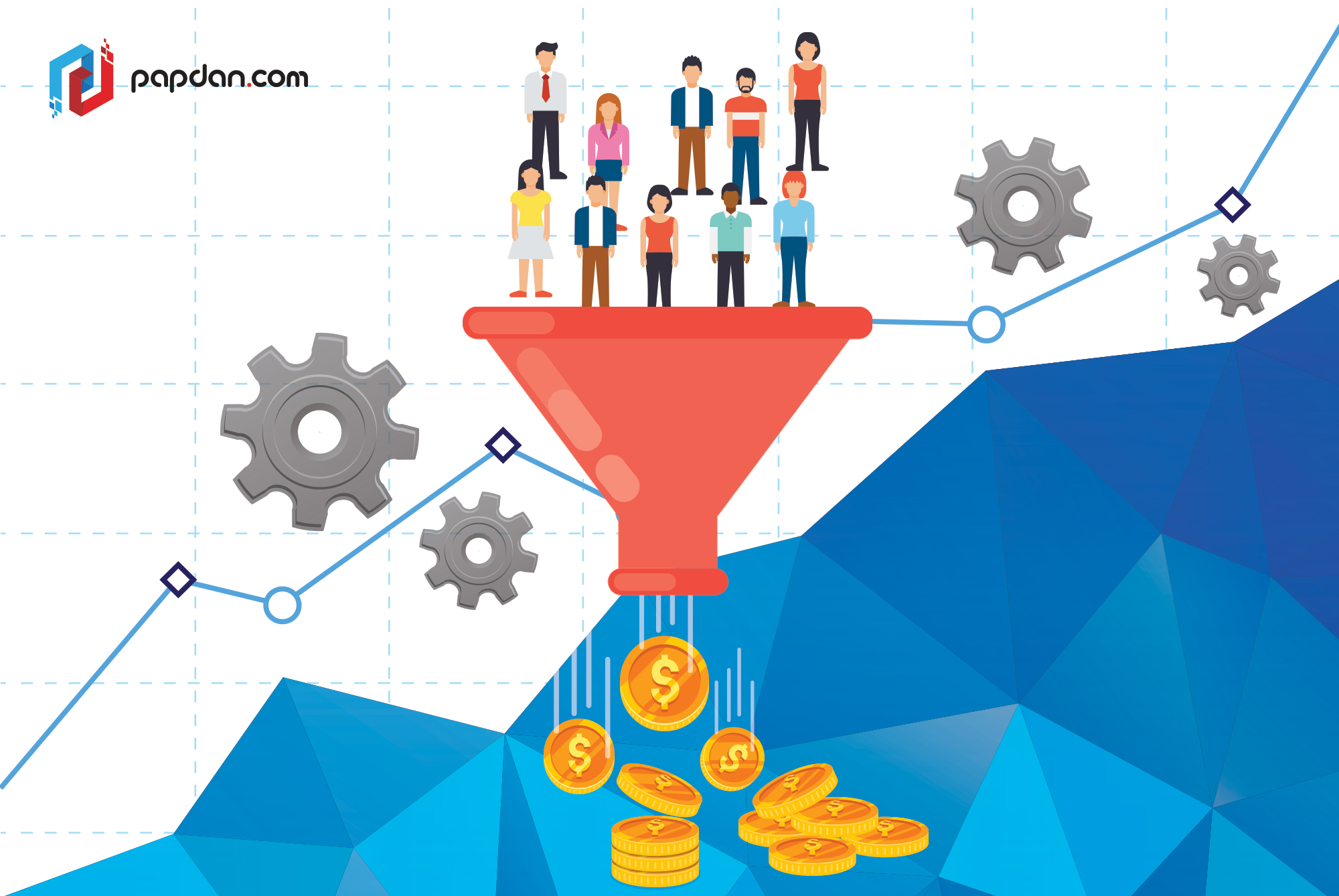
Conversion
It is a state where a visitor or a lead completes a desired action. In other words, the visitors have successfully signed up to your website or checked out an item in your shop.
Conversion Rate
When you divide the total number of conversions by the total number of visitors on your website, you will get a percentage of visitors who take a desired action on your site.
Conversion Optimization or Conversion Rate optimization (CRO)
It is a systematic approach of refining your website which result in increment the number of visitors to your site who take a desired action.
The Landing Page
It is a home page of a website or any page on your site where the visitors would land to convert them into leads or customers.
Multivariable or Multivariate Testing (MVT)
A process of testing multiple variables on a particular page at the same time that aims to find out which combination converts the most.
By understanding the keywords above, you can broaden your knowledge about conversion rates and now you may be ready to read several ways that can produce you better conversion rates:
- Increase Conversion Rates by Keeping It Simple
It might come to surprise that by stripping design and content down to only the most vital elements, you can improve conversion rates. If you have a dramatic drop shadows, gradients, and other “realistic” visual effects, you can remove it to create a clean and simple two-dimensional design emerges.
In fact, by focusing on fundamental elements instead of embellishments, this two-dimensional approach can be super helpful in creating an orderly layout and optimizing conversion rates. Furthermore, you can create more spaces for any important calls to action (CTAs) to show up without being distracted by unimportant elements.
Usually designers will put some sort of depth or dimensionality on buttons. This will help people to avoid overlooking on buttons when they’re scanning through a page. Therefore as a solution, you have to choose a contrasting button color and a location that makes your button’s interactivity obvious, such as roll-over styles and visual tricks that will attract visitor’s attention.
- Build Logical Layouts to Maximize Conversions
Even though, you are applying minimal aesthetic designs, but still you have to consider about an underlying logic of the placement of content. This means you have to make sure that users will feel at ease when browsing from one idea to the next idea on your site. Right now, the F-pattern is one of the easiest patterns that can ensure your layouts adhere to human reading patterns, like the F-pattern. The important thing is to think about the action you want people to take as naturally as possible in the most frictionless way.
- Optimize by Adding Context to CTAs
We cannot deny that certain copy works better than the others in terms of making your CTAs work well. One of the examples is a travel company called Nature Air created a bunch of pages for their website. However, in their first trial, the CTA was general. They write “Daily Fights throughout Costa Rica”, then paired it with “Book a Flight” button. Once they revised their CTA’s copy to “Fly to Tamarindo from $58” , Nature air gain an increment for 591% in conversions.
- Use Responsive Design to Convert People on Every Device
Nowadays, everyone goes mobile, therefore to make your website works on a wide variety of devices; you should consider a responsive design. In fact, responsive design is a key for conversion rate optimization on e-commerce websites. However, having responsive design will require you rethinking navigation. Furthermore, you have to pay close attention on how to lay out elements on desktop will translate to mobile devices.
- Sliders and Carousels can Hurt Conversion Rates
Some designers may notice that image sliders or carousels have been neglected over the past several years. There are many reasons that cause sliders or carousels become unpopular, but the main reason is because it can slow down your websites, especially if you have many large images. Besides, it can be easily distracting people to pay more attention to the movement of sliders and carousels than the conversion points we want them to focus on. Furthermore, sliders require you to swipe while mobile users will prefer to scroll than to swipe, this will surely affect your conversion rates. Not to mention, how sliders can bring bad impact to your page ranking since sliders can bring too many H1 tags to your site where web crawlers hate it.
- Use a Card Layout to Optimize for Mobile Navigation
Card layout is another design approach that’s evolved in response to increased mobile browsing. These cards rely on visuals and sparse copy to highlight the most vital information, just like Google’s mobile search results. If you are planning to work with a modular design approach, you will find card layouts work perfectly with it.
Basically, a card layout will help people move from one idea to the next with each container, gradually digesting the overall message. Moreover, its simplicity will be also translated easily to mobile devices. In fact, cards can create a logic and rhythm that enhances the overall user experience when it is done correctly.
- Choose the Right Colors to Increase Conversion Rates
Most of people still make decision based on emotion that is why emotion still plays an important role in determining whether or not people will buy your product. One of the elements that can easily evoke people’s emotions is colors. Colors evoke emotions and people make purchase decisions from an emotional place. Therefore, you have to be careful in choosing the right colors that can encourage visitors to buy your product.
- Write Content that Converts
Having a thoughtful layout and stunning images isn’t enough, your website still needs a good copywriting. A good copywriting should bring a huge impact on how people perceive your brand while bad copy would fill your site with bad or misleading copy.
Before you create a copy, you better do a research about who your audiences are. By knowing your audiences, you can use language and a tone that they understand and approach them in the most effective way possible. Above all, it is important to focus on the benefits the visitor will experience by acting on your offer. Make sure, users know how having your product or service will change their lives, then you can easily convert them.
- Optimize Your Headlines
Headlines can be the first and the last copy that user’s read. Therefore, it is imperative to grab people’s attention and keep them reading, but how to create an eye-caching headline?
- Leading with the benefit (what the reader will get out of the page)
- Being concise, but provocative
- Using humor or creative wordplay
- Staying away from clichés (you can add humor and use creative wordplay which can be totally different from actually using a cliché)
If your headlines sound like your competitor, we suggest you to change it as a good headline should be creative and unique.
Of course, the success of your conversion rate will not rely solely on your content design, but also with good copy and good developed site. Hopefully the 9 tips above can help you manage the tips that will produce you a real result once it is applied.
