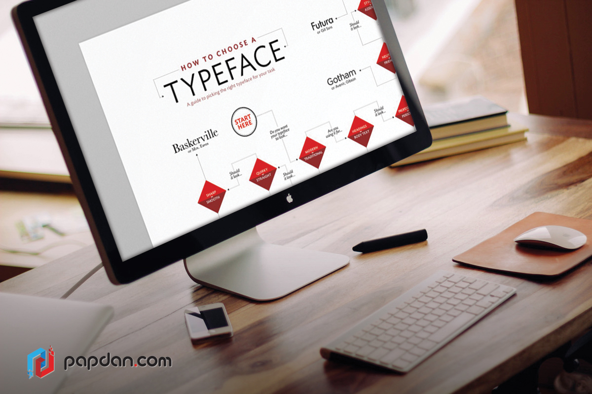
You might be wondering why certain types of brands adopt certain types of fonts. This is because many web designers and fashion brands know that certain styles of fonts represent specific emotional attributes. If you want to create specific mood for your brand, you should read the following information to express a timeless style of your brand.
- Serif or Sans Serif?
First of all, you need to make sure that a serif or sans serif design is suitable. This serif design is firstly derived from carved inscriptions of the Roman Imperial period and has survived until now with a little change. Generally, this kind of font is suited to cultivated, academic and more thoughtful communication.
Many people like serif design for it helps to combine or ‘glue’ letterforms together into word elements. Besides, you’ll get more clearly defined horizontal rows of text with the internal density that serifs provide. This makes the process of switching from the end of one line of text to the beginning of the next more efficient. No wonder that nowadays, this design is used initially for commercial headlines and advertisements. However, they are not good for text of a book, magazine or newspaper for their low contrast and absence of serifs make most sans typeface harder to read. This also works the same in digital form and screen resolutions which the design renders as accurately as the reading sizes we normally find comfortable in print media.
- Consider the Font Contrast
The next step is to consider which contrast works best with your brand. Apparently, when used at display sizes, high contrast fonts generally are more effective. In fact, it shows their elegance better. However, it can reduce visual definition when it is used for text. Moreover, low contrast fonts can also present limitations, but for different reasons. You may see a good result in larger text sizes but their reduced internal space also reduces visual definition for text use in general, their reduced internal space also reduces visual definition. Both of them provide different benefits in display typography: high contrast designs offer classical dignity and grace impression while lower contrast designs provide a sense of robust solidity, confidence and permanence.
- Think about Font Stress
The flowing rhythm of the text, enhanced by naturally occurring oblique ascender and x-height serifs, serve to combine individual letters more readily into clearly defined word elements. The irregularity and down-to-earth familiarity of these designs seems to invite the reader to enter the text and read.
- Don’t Forget Vertical Stress
When it comes to magazines and posters, vertically stressed moderns have a more refined, austere elegance about them, qualities that are best appreciated when used at display sizes for magazines and posters. Its sizes make reader wants to look at the text rather than read.
Moreover, if you want to build lowercase letter, including the more complex ‘a’, ’e’’s’ and ‘x with compromising their definition at whatever range of size the font is.
05 Counter Balance
Open or closed counters will strongly influence designer opted for corporate branding needs, where fonts are required to perform effectively over a wide range of media and sizes with an economy of space. However, these fonts are usually monolinear, so there is sufficient internal space within the letterforms and to consider restrictions to their width proportions. To solve this problem, designers will choose humanist design as the solution. Besides, architecture of the letters helps provide more internal space.
You can find closed counter styles are available in the form of the grotesque design in which the outer loops of ‘a’,’c’,’e’, and ‘s’ are hooked in towards the middle of each letter. Furthermore, in case of maintaining their flexibility and legibility at small sizes, these fonts are generally made with an enlarged x-height and with the widths of the enclosed characters increased. However, at text sizes, there is a corresponding reduction in legibility at text sizes.
Choosing the right typeface for a brand may be quite a challenge, since not only does it require accurate reading sizes, but it also needs to represent a brand in a more authentic and enticing way. Hopefully, with these tips, you can learn and understand more about the right typeface for every purpose.


