
Love it or hate it, flat design has become a new trend today. Many website owners, theme developers, and web designers are adopting this design. This is because they believe that this design emphasizes usability, open space, and a clean interface. Besides, in some ways, flat design also provides pleasing aesthetic to your website.
If you are interested in trying this design on your web, you can read the following information to maximize this trendy design on your existing website.
- Lack of Depth
Drop shadows, strokes, bevels, and gradients have gained their popularity in the olden days where many web designers aim to imitate real looking objects with textures and colors to add depth. However, since Apple release iOS 7 iPhone with flat design, many phone and computer apps follow and adopt this design. Flat design aims to provide a simpler visual effect. Nowadays, this trend has become a new style.

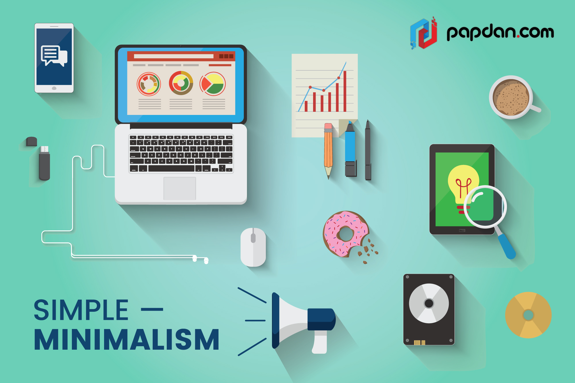
- Minimalism
Flat design implies simplistic, minimal, and clean layouts. Instead of using animations, 3D effects, and attractive flashy embellishments, flat design applies vibrant color palettes and simple lines to create the appearance of impressive UI design.
This enables a talented flat design graphic artist to be able to create movement, depth, and visual appeal using basic line structures and bright colors.

- Typography
In order to enhance the overall look of the web page and bring visual excitement to anyone viewing the page, website owners can have more room to add bold typography. However, make sure your typography choices are not too over the top. However, because of the simplicity of flat design, an overly embellished font choice may look out of place.
Moreover, when using flat design, content is going to be the crux of your website. This comes as a result when you are no longer relying on special effects to attract readers. In fact, as a website owner, your primary job is to engage readers even if your site has a minimal feel to it. So, the best solution that we can offer is to have plenty of font options for variety while still maintaining a consistent primary typeface through-out.

- Visual Hierarchy
Using bold color schemes in light and dark variations will help you distinguish between different UI elements, contrasting font styles and sizes, and muted background environments, so the simple designs you are sharing with readers will stand out easily.

Moreover, it is also important to know that material design elements rarely intersect each other. On the other hand, you will need to switch between color schemes and box content to offer something real and usable.

Generally, color palettes of flat design have more varieties, beyond the typical 2-3 colors. Instead, they contain as many as 8 colors within one image. However, the most used colors in flat design are salmon, purple, green, and blue.

Hopefully, after following these flat design best practices, readers can understand the flow of movement throughout your website. Google recommends using color and composition, only a few meaningful elements at once, and images that tell a story upon first glance.
- Simple Elements
Basically, flat design often focuses on simple interface items like icons and buttons. Moreover, they will create movement and depth in simple shapes like rectangles, squares, and circles, while being the remaining 2D and flat in nature.
Their simple design encourages users to interact with them with simple clicks or taps. Furthermore, by applying minimal shape, you will easily pair seamlessly with other elements.

To create a usable visual hierarchy to readers, there are some quick tips that you can follow:
- Make sure all elements are clear and visible
- Allow for sufficient color contrast and size
- Employ a clear hierarchy of importance
- Make sure key information is readily seen
- Ensure easy navigation of your site by reinforcing color, text, shape and motion.
After all, the simplicity aims to focus on your website’s content without appearing drab and boring with fancy color palettes, simple shapes, and bold typography. Instead, the priority is to get readers excited about visiting, navigating, and engaging in and with your website’s content. So, don’t forget to incorporate all of the above concepts into your design whenever you want utilize flat design concept.
