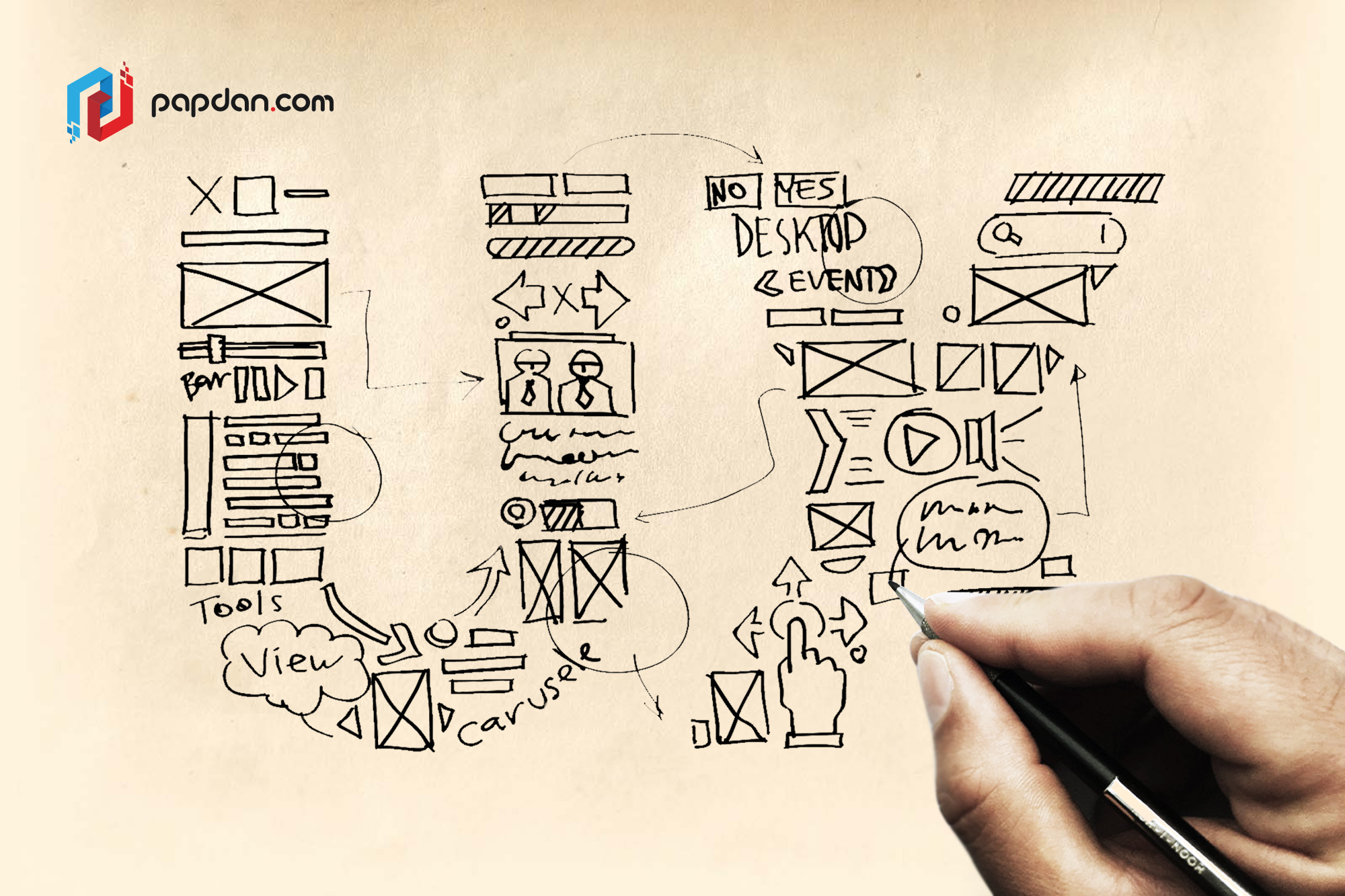
Sketch is the first thing every designer will do before implementing it into something real. This makes sketches become the earliest foundations that you will build upon. It works as a bridge between nothing into something. Therefore, we collect 4 different UX designers for 5 different techniques guaranteed to improve your UX sketching. If you are a web designer, this article is certainly for you.
1. First Write Down the User Problem
If you are confused about how to begin with, you can always start by writing out the user problem. Then, draws your experience with other interfaces to determine how to solve the problem, you can focus on the navigation menu and the main content. After that you can design the basic outlines of the cartoon’s head and body. Only later comes the secondary content and details, the arms, legs, and facial features.
Moreover, you also need to follow the old golden ratio, 1:1.6 a “gold standard” of aesthetic that has been used for years. So, before you draw your ideas on top of it for guidance, you can try to sketch out the golden ratio first. If you follow the golden ratio, the main content area should be 640px and the sidebar should be 400px.
2. Sketch in Layers with Increasingly Darker Pens
A sketch should not be perfect, but that doesn’t mean that you can create it carelessly. To obtain a good sketch in layers, you can use a darker instrument for each successive layer. Here are how to use it:
- Multiple drafts build on each other instead of starting from scratch
- You can outline the structure of your sketch before considering the details
- Early mistakes aren’t as noticeable
We suggest you to start with a light-gray marker, 20-30% gray. The hue of the instrument can be increased depend on how many layers you intend to create. When you’re almost done, you can use a 60% gray marker or comparable instrument.
3. Start with the Smallest Screen and Work Up
You can apply sketches to all aspects of the design process. Usually, designers start sketching with the smallest screen and works upwards, from mobile => tablet => desktop. There are three reasons why this approach is the best way:
- You will prioritize content right from the start as you have no choice.
- If you start from desktop, it could lead to complications and backtracking for you will take piece away as you advance.
- Working with small screen will bring you to solutions you wouldn’t have thought of.
4. Try the 20-minute Whiteboard Design Challenge
To train your problem-solving skills, building team unity, and even refining sketching abilities. You can try the 20 minute Whiteboard Design Challenge which works like this:
- Designer chooses a product challenge at random from a premade list.
- One of the members should be a host while the other pair is designer.
- 20 minutes is given to work out the problem through sketching on the whiteboard.
- The jobs of host are to observe, keep the designer on track with time, and answer the designer’s question.
- The host spends10 minutes giving the designer feedback when time is up.
- In the end, the designer and the host swap roles, pick a new challenge, and repeat.
Now, we have these 4 tips that are waiting to be applied for. So, what are you waiting for? Apply these 4 tips today and see how your sketch improves day by day!


