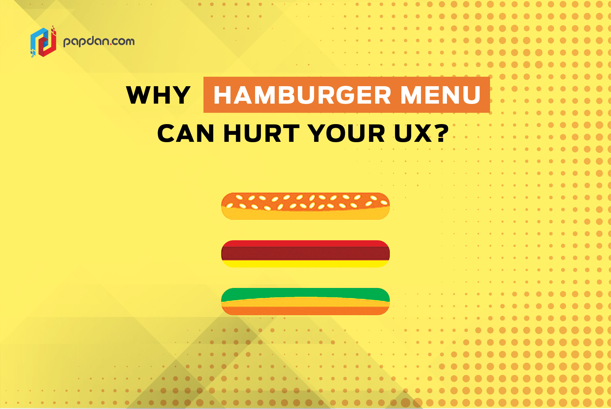
Hamburger menu is one of the most popular menus nowadays. But, does it really fit your app? The fact is some people find it hard for navigating the menu and finding what they are looking for. So, as web designers, do you agree with this statement? Read the following information and figure out by yourself.
The Pros and Cons
Many people love hamburger menu because it can save a lot of screen space. Besides, it gives you a simple and clean design. However, Hamburger menu does not work well all the time. It requires users do more work to move between sections of the app. As a result, it increases the interaction cost to the user. Moreover, a hamburger menu can complicate the app structurally through its simplicity design. This is because three little lines provide no information scent.
So, it is important to questions things related to hamburger menu. Such as, do your users understand that three horizontal stacked lines means menu? Have they interacted with a hamburger menu before and are that experience extensive enough for them to quickly understand what it means?
Unfortunately, hamburger menu is one of the trends that designers usually don’t question further. If it is so typically you, this can be dangerous. You don’t consider if that choice makes sense with the context of your app experience and its users, especially, if you apply to primary navigation.
In the following passage, we will see some major companies that use hamburger as their mobile apps menu and why they use it.
When to Use and When Not to Use
Here are a closer look at a few different solutions to mobile navigation, and the pros and cons of each design.
FitBit
FitBit is considered as quite successful in managing a lot of complex data. This is because they can make it simple and easy to understand without the need of hamburger menu. The closest they get is the teal “Add” button at the bottom of the screen, which expands to show which types of information the user can add. Fortunately, this works. It can be because it is thumb friendly and doesn’t hide any key information.
If you notice, Twitter has a lot of features but every single one is accessible in a single tap. They use scrollable menu to effectively display multiple content categories at once.
Uber & Lyft
Both of these companies use hamburger as their main navigation. Their choice is right as in this context the primary goal of the apps is to schedule a ride. Therefore, the users should be able to access their schedule ride from the main screen.
Amazon
Since you can find anything in Amazon, hamburger becomes a smart choice to simplify the interface. Moreover, the app uses a fully expanded search bar. This help users fine everything in everywhere without worry of anything.
Ebay
Just like Amazon, Ebay is also popularly known as one of the biggest market place. They used hamburger menu once, now it seems like they prefer using a tab bar. And there isn’t much information on why they change their design.
The above examples show that we need to cultivate a careful thought and deep consideration before applying hamburger menu. So, at the end is not all about following the current trend. However, it’s all about the context of the app’s goals and end users.


