
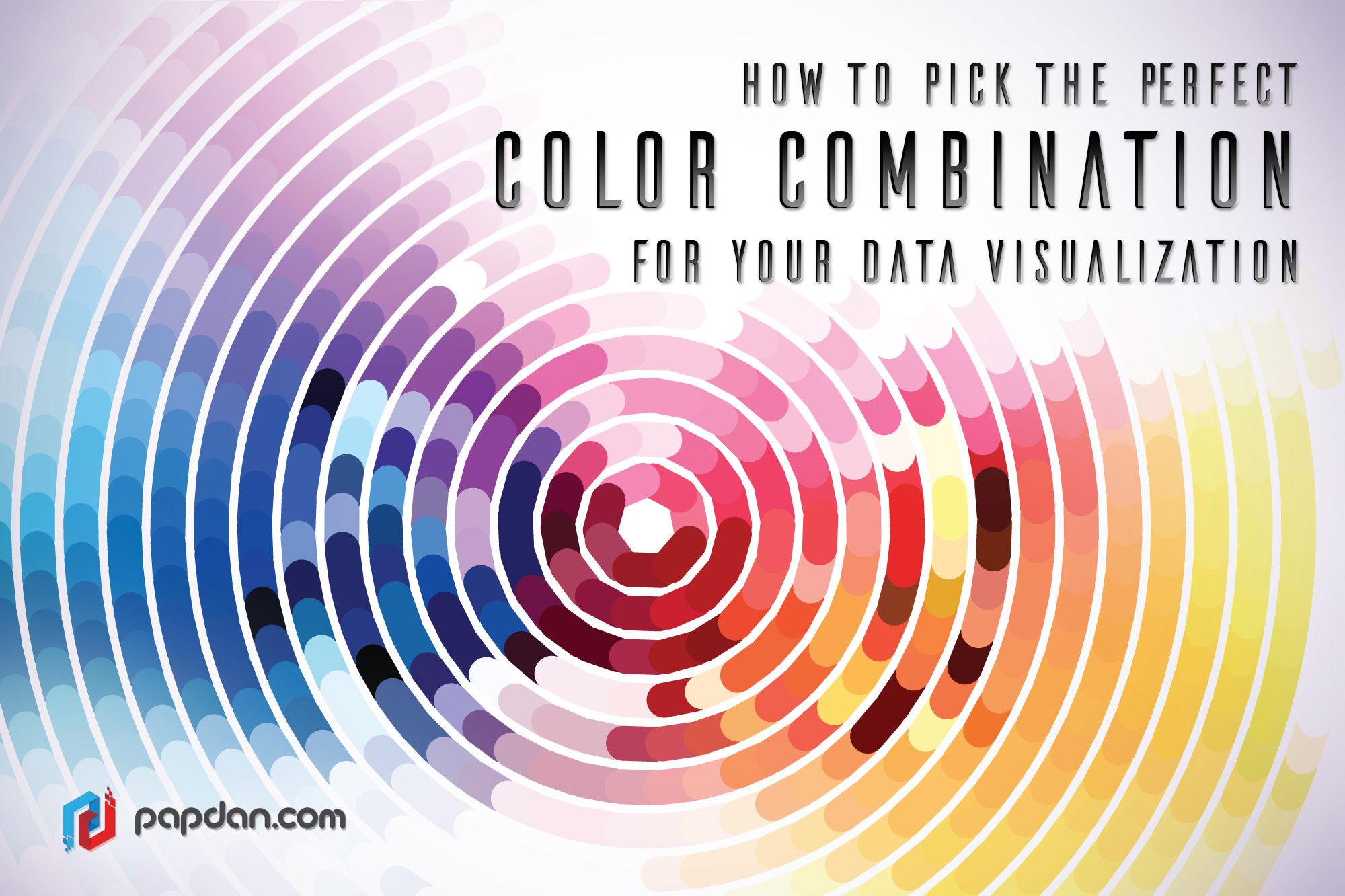
As we know color is the important element when it comes to data visualization, choosing good color scheme – whether for graphics, websites, brands, etc. can sets the mood for anything and everything you create. Moreover, colors are usually used in data visualizations to represent more than just one idea. So, how to arrange the right color scheme that can represent your data visualization better? Below are some information that every web designer and graphic designer should know.
Is Your Data Sequential or Qualitative?
The first thing that you should understand before choosing a color scheme is to acknowledging the importance of data that you’re working with. Besides, there are three main categories that one should consider when choosing color schemes for data, such as sequential, diverging, and qualitative color schemes.
Sequential color schemes are used when you wish to organize quantitative data from high to low using a gradient effect. Moreover, quantitative data is more suitable to be used when you want to show a progression rather than a contrast, since it is less confusing when you want to show you any progression.

Diverging color schemes reinforce to highlight the middle range/extremes of quantitative data by using two contrasting hues on the extremes and a lighter tinted mixture to highlight the middle range.

Just like its name, qualitative color schemes are used to highlight qualitative categories which you surely want to create a lot of contrast through its data, which means using different hues to represent each of your data points.

Moreover, you can just blend all color schemes that you would like for example; you can use both a sequential and qualitative color scheme in the same visualization. Therefore having a scheme that uses both gradients and unique hues is the best solution.
The Role of Brightness in Color Selection
Another very important tip of data visualizations concerns understanding and utilizing the brilliance of colors for a purpose. In the two pie charts below, notice the brightness of the colors used. Try to use equally bright hues with contrasting colors to display your data for qualitative data, unless you attempt to point out one specific data point’s significance while shading is important for sequential quantitative data because there is a great tendency for using a gradient.
Tools that You Can Use to Find the Perfect Color Combination
Don’t worry if you think you don’t have a strong grasp on basics of color selection, since there are many simple tool that are highly recommend to find a scheme that’s already out there, such as colorpicker for data, Color Hunt, Designspiration.net, FlatUIColorpicker.com and Adobe Color CC. Try it all and pick one that suits your style.
What If You Still Can’t Find What You Need?
After all this, if you still find it difficult to get inspiration for these types of color scheme, you can draw on your surroundings, for example you can take inspiration form a colorful photo, a mural, a sunset, or anything in nature.
