
It’s time to make your first website. What are the pitfalls and lessons that companies make when setting up a new website? Here is our simple guide to making websites that work and having the right content on it.
To create the perfect set of webpages is quite simple. By focusing on the audience, before even the look and the usability of the site, you can design it so that reading it and browsing it becomes a pleasurable experience. The question is not “What pages should a website have?”, but more like “What does my customer want to find out about me.”
- The most important advice we can give is to target the website to your end users. Who are your customers? Do you know? If you have been running your business for a while, then this should be easy to identify. It should be your aim to talk to them, and not to the rest of the world that doesn’t buy or need your product.
- Once you have established this, it is time to your write your text. Many new companies that contract web developers like us, will often leave the copywriting to the web guys thinking that we know best, and often with instructions such as – just copy those other guys with the similar website. This is usually the biggest mistake that the company make. As hard of a task as it may seem, if you don’t dedicate your energy to clearly explain what your company is all about, then how do you expect the website to sell your services? Spend more time on the copy than on the pretty photos.
- Establish credibility by outlining what you do, and what you have achieved. Tell people the benefits to your service so if they are reviewing you, they can easily make a decision to select you over your competitor. Remember, you often have only one chance to engage and capture the customer. If you don’t have a well recognised brand, then you need to make sure that what you say is succinct – to the point.
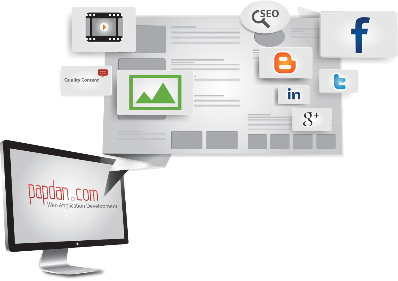
- Do you know what search engine optimisation, or SEO, people will tell you to change on your site? Text, text and tagging around your text. Very little attention is paid to images, and photos, although, there is an art-form around tagging your images properly too, but primarily, it will about what you write, and making it include words that you are trying to target. So let us just reiterate – what you write about your company is going to be the most important step in setting up your website.
Now that you have all the content, it’s now time to let your web developers create magic. Make sure that you watch out for the following important aspects to your website.
- Having the right words is one thing, but with badly selected design and images, even a well written marketing website can have people clicking back to their Google results faster than you can say “wait!”.
- Make sure that photos are not squeezed or stretched out of proportion so that you don’t look amateurish.
- Multiple elements on the page that are blinking, bouncing, scrolling or turning in circles will turn off your visitors.
- Keep a consistent font and style for the text used for headlines and body copy
- Colored background graphics or textures make it difficult to read the type
- Background graphics that are inappropriate for the content of the site should be avoided (eg.: bubbles on a site selling bookkeeping services)
- Text that is out of alignment will make it difficult to read.
Your Web site isn’t “about” your company, it’s an extension of your company. If it’s unprofessional, you’re unprofessional. If it’s cluttered, you’re cluttered. If it’s hard to work with, you’re hard to work with. And if you don’t grab the target audience, then it’s no point to even have anything other than an address and a phone number.
The first impression your site makes should be one of professionalism and appropriateness for the markets you serve.
- Makes sure your site looks Professional
- Don’t use the name of your company as the web page title only, but briefly explain what is it that you do
- Don’t let your home page be a flash presentation about how cool you are if it’s not suitable. If you are selling your service, you need to sell the benefits. If you are a restaurant, you need to sell your food – less words – more pictures.
- Focus the home page & product pages on your customers’ interests, not yours
- Avoid a cluttered look
- Minimize graphic sizes to make sure your pages load quickly
- Be sure you’ve included important supporting information that your customers often ask you for. Make it easy for them to make a decision without having to bug you, because often, they will decide not to
- Make sure it’s easy to place an order or to enquire.
- Be sure your contact information is easy to find
- If at all possible, share links with other businesses and organisations in your community
