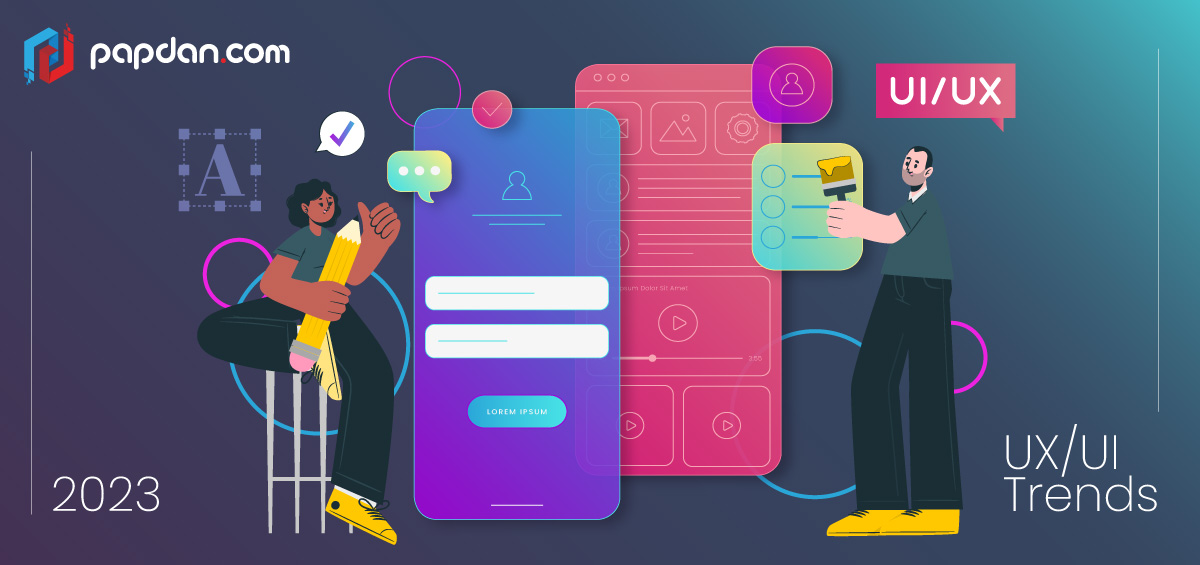
Technology’s potential is continually being realised, and as it develops, so do trends in digital design. 2023 is here and brings with it intriguing ideas and cutting-edge developments that will enhance and revolutionise user experience (UX) and user interface (UI) design.
Why it’s necessary to follow the newest UX/UI design trends
As web designers in Melbourne, it is important keep up to date of the most recent technological advancements that may affect user expectations, from colour theory to inclusive design. Remember that the user’s first impression of your brand or business is greatly influenced by the product’s UX and UI when developing a digital product, such as an app or website, and make sure you are adhering to industry standards.
5 UX/UI trends to look out for in 2023
The most recent UX/UI methodologies will be taken into account in a human-centered design in order to enhance overall usability, functionality, and visual appeal.
Here are five innovative design trends for 2023 that you might want to think about:
Motion Design
It used to be difficult to create animations for websites and mobile apps since teams had to constantly choose between animation quality, site performance, and app size. Since then, a lot has changed. Changes in bandwidth and the addition of libraries now make it possible for designers to produce beautiful animations with small file sizes and smooth operation.
Experienced designers can now add motion design to their toolkit thanks to the adoption of these technologies. We have no doubt that as time goes on, animations will become more and more prevalent in designs, not only to make them more dynamic and aesthetically pleasing, but also to make the user experience more seamless and to wow them with amazing micro-interactions.
Gradients
Gradients may have gained popularity as a result of social media and fashion, but it seems the 1980s and 1990s are making a comeback. This translates into more cool clothing and vibrant colour options in the fashion world. This has manifested in the digital world in a variety of ways, including the resurgence of gradients, the adoption of brutalism, and vibrant colour schemes.
Gradients are a significant trend that has been widely adopted (and accepted) this year and that, in my opinion, will continue for the foreseeable future. We’ll have a lovely, colourful procession of screens, packaging, and more shown around us, along with how individuals are employing more upbeat, multicoloured palettes—as if to combat the exhaustion Covid has induced.
Immersive Scrolling
The preceding idea—motion design—has a lot to do with immersive scrolling. Most designers used to think about how users would scroll through websites in terms of the order of the material. For instance, what hierarchy should be employed to express the stories that their clients want to share and what order was ideal for users to understand the message? Even with the occasional animation or video, everything was still.
Smooth animation creation and implementing component behaviours on scroll have never been simpler thanks to Javascript, animation libraries, or native implementations (such linear interpolation methods). We can now deliver content in a more strategic, narrative-centered manner since designers have control over what content to display and how it will appear to users. Immersive scrolling has created a wide range of opportunities for presenting compelling stories, and I’m confident that many businesses (with a concentration on landing pages) will take advantage of this to captivate their consumers.
Brutalism
Another trend from the past that has returned to our screens this year is brutalism, and I think it will either remain in its purest form or in some subvariants like kitsch or neobrutalism. We also observe echoes of earlier online design, when things were less corporate and more personal and organic. The browser default typefaces, gradients, high-contrast colours, boundaries, and homages to vintage visuals and artwork combined with actual photos are all back. You know, all those quirky aspects of the web that make it fun to browse, but with all the UX lessons to make everything as readable and accessible as possible.
Wellness
Many people became aware of the importance of mental health and general wellbeing during the pandemic era and the normalisation of the home office. People discovered that it’s acceptable to give oneself priority. This, in my opinion, translates to people paying more attention to their routines, habits, and general mental and physical health. Additionally, I believe that this behaviour will lead to the emergence of a number of related trends within the design sector. This would entail a larger-scale uptake and development of wearable technology for monitoring both mental and physical health, or it might even entail the use of subdued, “calming” colour schemes on screens.
Final thoughts
With so many cutting-edge technologies at our disposal, we have the chance to create engaging stories with beautiful, approachable design. Following the most recent trends can elevate your user experience and put you ahead of the competition in your field.


