Have you ever been faced with two options in your life? I think almost all of us have. Honestly, if you have more options, it will be easier that way than having to choose between two options. Why? That’s because if you have more options, you can clearly see what’s missing and what’s not because there are wide selections that you can choose from that will be the best out of the best. However, if you only have two options, you will have to explore their advantages and disadvantages one by one and estimate their effects, should you choose one of them. Also, when it comes to decision making, we have to consider a few things before choosing the right one. The same problem often happens to me when my friends from the Melbourne web designer team ask for my opinion about whether I am, as a ‘customer’, fond of skeuomorphism and flat design or not. Since I am a writer for digital marketing, I am required to be as open minded as possible. So they brief me a lot about skeuomorphism and flat design and this got me thinking about you too. If you are a business owner looking to make a website but don’t know how to start with the idea of its design, I’m going to explain to you about these two design decisions you can consider for your business web design; skeuomorphism and flat design. Keep reading this article to find out!
First, what is Skeuomorphism?
Skeuomorphism is a realism design that imitates real objects, shadows, shades, shapes and details from the physical world. That’s when a drawing or an illustration appears as real as a photo or a 3D image. While it is more beautifully designed and it is looking good in appearance, it lacks functionality because of the huge amount of clutter on the desktop, as skeuomorphism brings too many useless details to our devices, which is bad for user experience.
Then, what is Flat Design?
To put it simply, flat design uses minimalistic approach to its design and two-dimensional elements as well as bright colours, being stripped of all 3D elements as if the image is lying flat on a surface. It doesn’t require 3D, textures, gradients and many others. Flat design is more focused on solid colours, fewer shades and gradients. This type of design is more effective when it comes to functionality, usability and app navigation because it doesn’t use complex graphics or animations and that makes everything load faster .
So, what’s the difference?
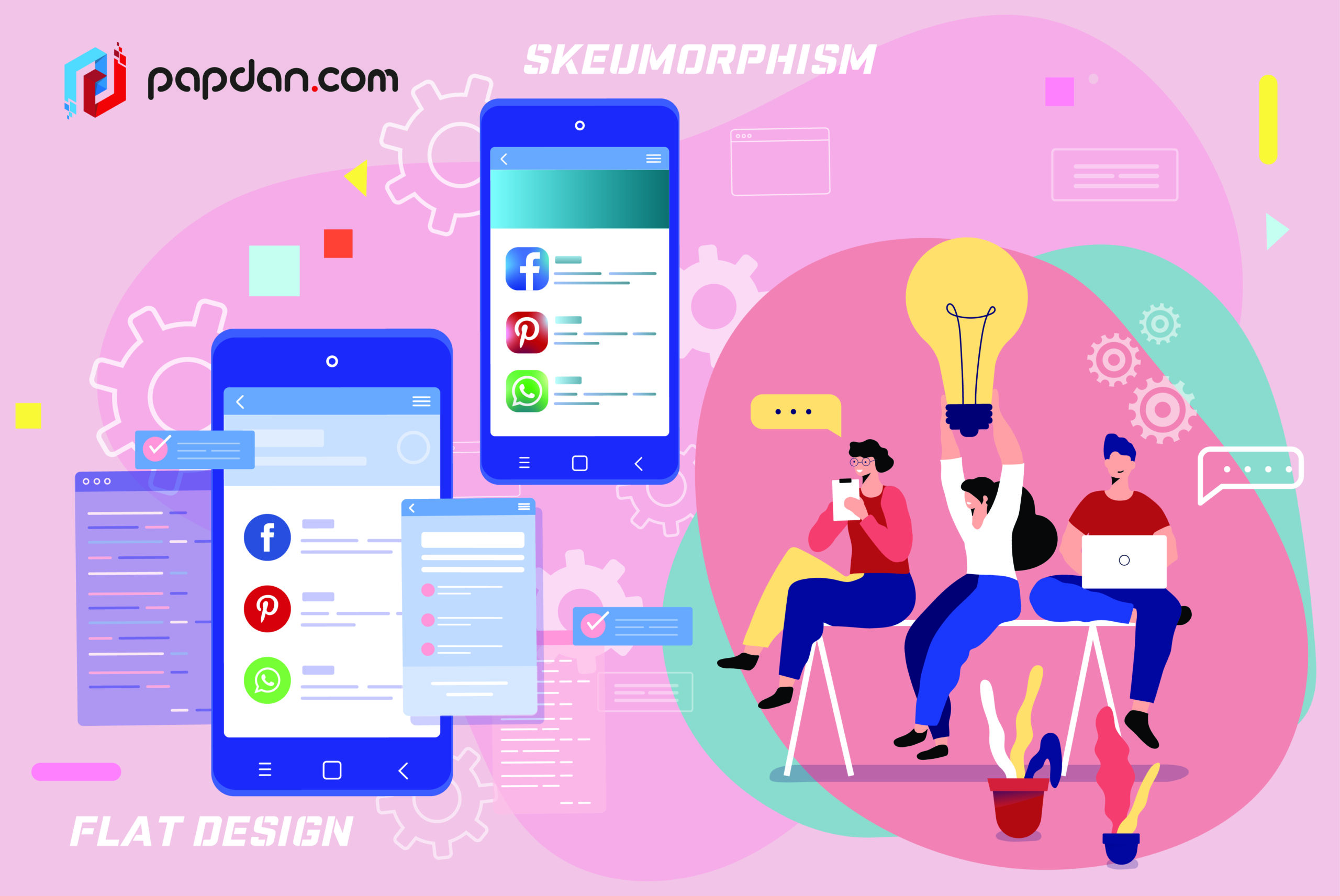
Since Skeuomorphism uses a huge amount of shadows, shades and details, users can innately identify depths, textures, levels and features. However, we can say that skeuomorphism is more focused on style to grab audience’s attention. Flat design, on the other hand, focuses on raw functionality. It is stripped of all artificial design elements just to have a simple design. Flat design is more focused on user experience, making it more efficient and practical. Below are the examples of skeuomorphism and flat design.


Which one should you use?
I know, I know, you might think I am one-hundred percent more into flat design than skeuomorphism based on what I said above. Honestly, trust me, I do believe that both are fine as long as they are done properly. As design is rapidly evolving, most web designers nowadays are focused on adopting a more modern design approach that is geared towards functionality rather than just form. If we are talking about the process and the time it takes to work on each design, both skeuomorphism and flat design take time and effort even though it looks simple. Skeuomorphism may lack in several areas like functionality and usability, but if your designer can balance between looks and functionality, then skeuomorphism will not be your problem. Whatever it is your design type, everything should need a balance so that your design will be useful and good looking at the same time.


